{{item.name}}
Price: {{currency}}{{item.price| numberThousandsCommas | numberDecimalPoint}}
Qty: {{item.amount}}
By Series
4K Gaming Projectors Home Cinema Series TV Projector Series Portable Projectors Golf Simulator ProjectorsBy Feature
Home Entertainment Best 4K Projectors Best Gaming Projectors Up to 20% World Soccer Promo GV Series Portable Ceiling Projectors House Mapping ProjectorsBy Trending Word
4K UHD (3840×2160) Short Throw 2D, Vertical/Horizontal Keystone LED Laser With Android TV With Low Input LagExplore Commercial Projector
Professional Installation Simulation Projection Small Business Corporation K12 & Higher EducationBy Feature
Photographer Monitors Designer Monitors Best 4K Monitors Best Monitors for MacBook Pro & Mac Best Monitors for Versatile MacBook Users Best Monitors for ProgrammingRemote Work & Learning
Explore treVolo Speaker
Dialogue Speaker for Learning Electrostatic Bluetooth Speaker Carry Case & StandProjectors
Monitors
Lighting
Remote Work & Learning
Interactive Displays | Signage
Store
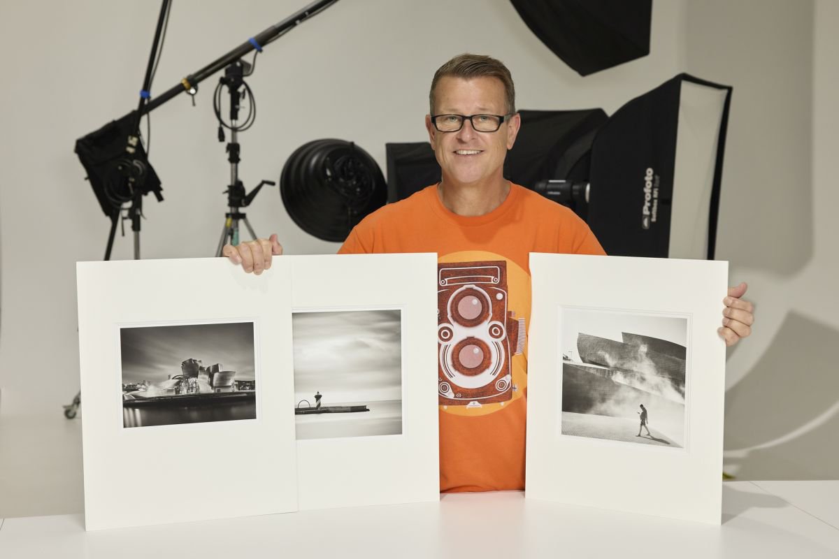
My name is Ian van der Wolde, I have been a professional photographer for over 35 years, and I am currently also a BenQ Photographers Monitor Ambassador based in Melbourne Australia. As a commercial photographer, I spend my working life ensuring that what I photograph accurately reproduces every nuance, tone and colour of my client’s products and wares. The importance a good colour managed monitor plays in this workflow can never be underestimated, but how important is a good colour managed monitor when comes to producing Black and White images?
When I am not shooting for clients my passion is Black and White landscape and urban landscape photography. My experience over the past 20 or so years has taught me that a good colour managed monitor is equally as important in Black and White as it is in colour. I am currently using both the BenQ SW321C and the BenQ SW270C monitors. Both of which are able to display 99% of the Adobe RGB gamut making them exceptionally good monitors allowing for accurate adjustment of colour and Black and White images.
Colour is an essential component in the process of crafting a fine Black and White image or print. In Black and White film photography different coloured filters are attached to the front of the lens to increase contrast and distinguish colour from tonality by filtering certain colours from the spectrum. For example, with Black and White film a red filter is often used to deepen a blue sky and make white clouds pop. This happens because the red filter lets the red wavelengths pass through to the film but absorbs or filters the rest of the colour. Again, using Black and White film, if I was photographing a red and green ball that were both the same tone, or contained the same amount of colour, the resulting Black and White image would show two identical balls, however if I added a red filter to my lens the result would be quite different with the red ball appearing darker and the green lighter, therefore using the colour to achieve tonal separation in the Black and White image.
Essentially, Black and White film can “generally speaking” only distinguish between tones not colour, so by using a filter we can control what “coloured” light is transmitted through to the film and what is absorbed, and therefore providing some control over tonality. This is however something that can be a little hit and miss or a little less predictable for someone who does not have the experience.
In digital photography we also use colour to achieve tonal separation and contrast in a Black and White image, but as we are converting a colour image we can make these adjustments before our eyes on a monitor, so it is not only more accurate but also more user friendly.
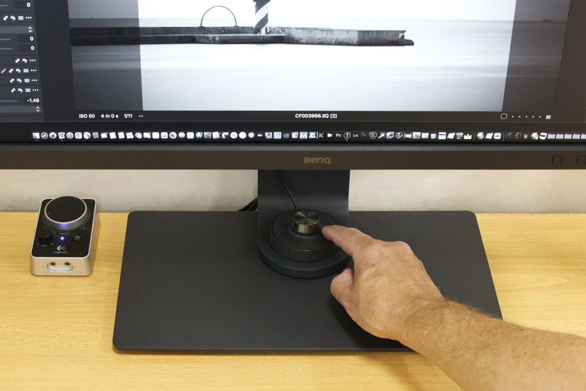
After initial capture, deciding on what image to convert to Black and White is the first step in the process and fortunately to make it easier the BenQ SW series of monitors have a Black and White mode to help.
This Black and White mode is easily accessed at the touch of a button on the Hot Key Puck. Using this process is a quick way of deciding which images appeal to you as Black and White and which files you would like to spend more time finessing into Black and White masterpieces in your preferred application.
For optimal tonal separation a Black and White image should be created using an RGB workflow, and as the BenQ monitors display 99% of the Adobe RGB colour gamut we can use all of that glorious colour to create definition between even the closest of tones.
As a contrast, creating a Black and White image simply by desaturating or converting to greyscale generally results in a flat lifeless image. Why? because just like Black and White film, desaturation only considers tone, not colour, think of the red and green ball I mentioned earlier.
Even if I intend to convert an image to Black and White I must first make sure the image is properly colour corrected and that there is enough colour information in the file for me to work with. Sometimes I may even increase the saturation in the file to provide more colour information to ensure I have enough to work with.
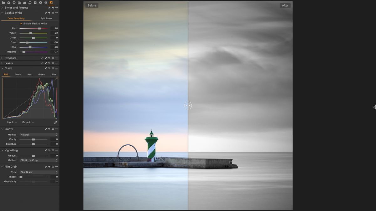
Once I have identified an image that I feel will work well in Black and White, I make my Black and White conversion in Capture One Pro which is my preferred RAW conversion software, but this can be done in most RAW workflows and also in editing software like Photoshop if you don’t have a RAW file. The important thing is that you use the Black and White conversion tool of that application not desaturate or convert to greyscale.
When you have selected the Black and White conversion tool in your software you will be presented with a black and white preview of your image as well as a set of colour sliders. This process considers the colour value as well as the tonal value in your image and without making any adjustments should already render a better image that if you simply desaturated or converted to greyscale, however, this is just the start.
If I refer back to the red and green ball scenario, we are able to individually adjust the tone of the red ball by sliding the red slider back and forth. The same with the green ball using the green slider. It’s really that simple. If you are finding that a component or object in your image is not standing out enough because the tonal value is similar to different coloured objects around it find the matching colour slider and make an adjustment. The obvious one is a blue sky. To darken the blue sky, I would select a combination of adjustments to both my blue and cyan sliders.
This is where a colour managed monitor like the BenQ’s comes in to its own, because the colour is having an impact on the tone we are seeing, so if the colour is not displaying correctly then it is quite possible the resulting tone is also not accurate, or we may even be using the wrong slider altogether.
My suggestion here would be to experiment with all of the sliders taking note of what effect they are having on the tonality and contrast of your file and if you make a mistake you can simply undo or reverse the adjustment. It is also important to not over do it by pushing your sliders too far. Subtle differences in tonality are often more aesthetically pleasing than bold high contrast or dramatic tonal differences.
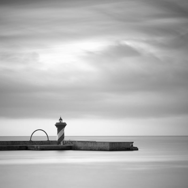
As the monitor is the device we assess and make all of our decisions on we need to be sure that what we are looking at is an accurate representation of the file. Displaying 99% of the Adobe RGB gamut, the BenQ SW Series Photographers monitors not only displays the colour accurately but also the tone, which in Black and White Photography means we are able to see when the detail in the shadow ‘blocks up’ or the detail highlight areas of the file become ‘blown out’. As well as that we can also see all of the tones within the file placed accurately which is critical when crafting that perfect black and white image or print.
Commercial & Fine Art Landscape Photographer/ Australia
Ian van der Wolde is a commercial photographer based in Melbourne Australia.
He is a Master IV Photographer, Life Member, Honorary Fellow and Fellow of the Australian Institute of Professional Photography & Photography Lecturer at Melbourne’s Swinburne University of Technology.
Ian is also a brand ambassador for BenQ, Ilford, Profoto and X-Rite.
Find Ian Online At
Photography Website www.alteredimages.com.au
LinkedIn https://www.linkedin.com/in/ian-van-der-wolde-2028a28
{{item.productWordingTag}}
{{currency}}{{item.finalPrice| numberThousandsCommas | numberDecimalPoint}} Save {{currency}}{{item.saveAmount | numberThousandsCommas | numberDecimalPoint}} Save {{item.savePercent | numberThousandsCommas | numberDecimalPoint}}%
new device price{{currency}}{{item.regularPrice| numberThousandsCommas | numberDecimalPoint}}