{{item.name}}
Price: {{currency}}{{item.price| numberThousandsCommas | numberDecimalPoint}}
Qty: {{item.amount}}
By Series
4K Gaming Projectors Home Cinema Series TV Projector Series Portable Projectors Golf Simulator ProjectorsBy Feature
Home Entertainment Best 4K Projectors Best Gaming Projectors Up to 20% World Soccer Promo GV Series Portable Ceiling Projectors House Mapping ProjectorsBy Trending Word
4K UHD (3840×2160) Short Throw 2D, Vertical/Horizontal Keystone LED Laser With Android TV With Low Input LagExplore Commercial Projector
Professional Installation Simulation Projection Small Business Corporation K12 & Higher EducationBy Feature
Photographer Monitors Designer Monitors Best 4K Monitors Best Monitors for MacBook Pro & Mac Best Monitors for Versatile MacBook Users Best Monitors for ProgrammingRemote Work & Learning
Explore treVolo Speaker
Dialogue Speaker for Learning Electrostatic Bluetooth Speaker Carry Case & StandProjectors
Monitors
Lighting
Remote Work & Learning
Interactive Displays | Signage
Store
“The texture of each character’s skin looks great on my screen, but then our 3D artist says the colors look wrong and now we have to fix it again.”
“I designed an entire UI in Photoshop with perfect contrast and color, but once I put it into Unity or Unreal, it all looks washed out and the buttons pretty much disappear!”
“I spent hours fine-tuning the lighting so that it looked perfect on my screen. But on someone else’s monitor, the shadows are gone and everything looks overexposed.”
Whether you're working on concept art, UI design, lighting direction, or even game trailers, these kinds of problems might feel all too familiar. Your team could be facing an overlooked yet serious issue: your monitors aren’t showing the same colors. When each team member is using a different display—with varying color gamut, contrast levels, and no standard calibration—you’re not just speaking different visual languages, you’re seeing entirely different worlds. It’s like trying to paint the same image using completely different palettes. And in the end, the final game may look nothing like what you originally envisioned during the design phase.
This article will help you discover how to ensure that your game designs are displayed the way you intended.
Pain Point 1: Mismatch of Color Between Concept Art and 3D Models
You can imagine a scenario where you’re creating beautiful artwork on a wide color gamut monitor (like a P3 monitor), but then your 3D artist views it on a standard sRGB screen. As a result, the colors look dull, and the entire aura you worked so hard to create gets lost.
P3 vs. sRGB, the same artwork loses depth and vibrancy on a non-P3 monitor (e.g.sRGB monitor).
Pain Point 2: The UI Design Looks Great in Photoshop, But Not So Much in the Actual Game
Your UI buttons and icons are vibrant and sharp in Photoshop, but when you import them into Unity or Unreal, the colors shift. Everything now looks faded and important UI elements have become hard to see.
Colors look vivid in Photoshop but appear faded in Unreal Engine.
Pain Point 3. The Lighting Looks Good During the Design Phase, but Falls Apart in Testing
You carefully balance the light and shadows during the design phase. But when you start testing the game, your QA team reports flattened shadows, weird color tints, or scenes that are way too bright. The whole look and feel gets thrown off.
These issues all stem from the same problem: Each team member is using a different monitor with no unified color standard.
Same scene, different monitors, shadows appear inconsistent and lighting balance is lost.
Color management doesn’t need to be complicated. In fact, it should be part of every game developer’s setup. Here are four suggestions that will help you build a more accurate and reliable workflow.
The first step is agreeing on a shared color standard. This includes:
This way, everyone will see the same colors and speak the same visual "language".
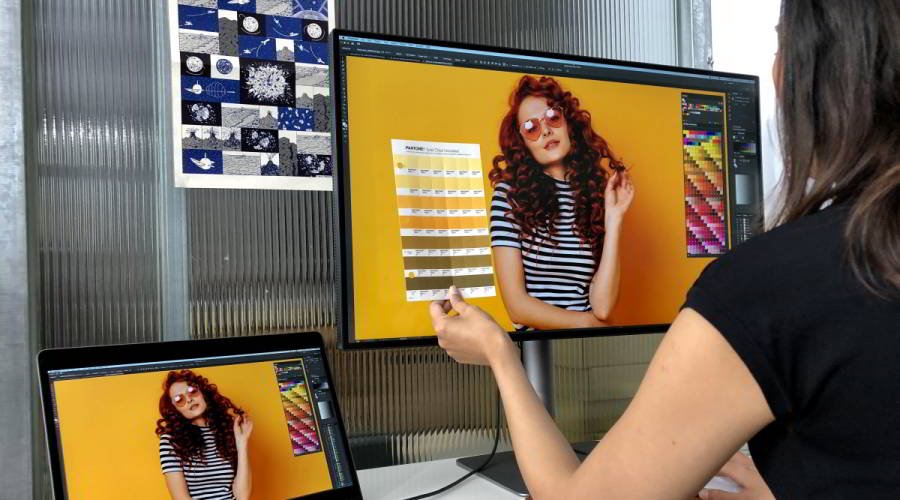
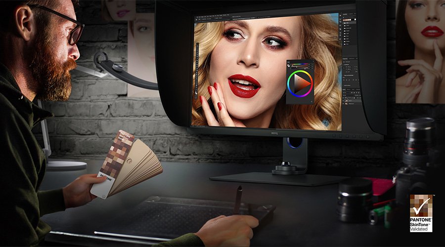
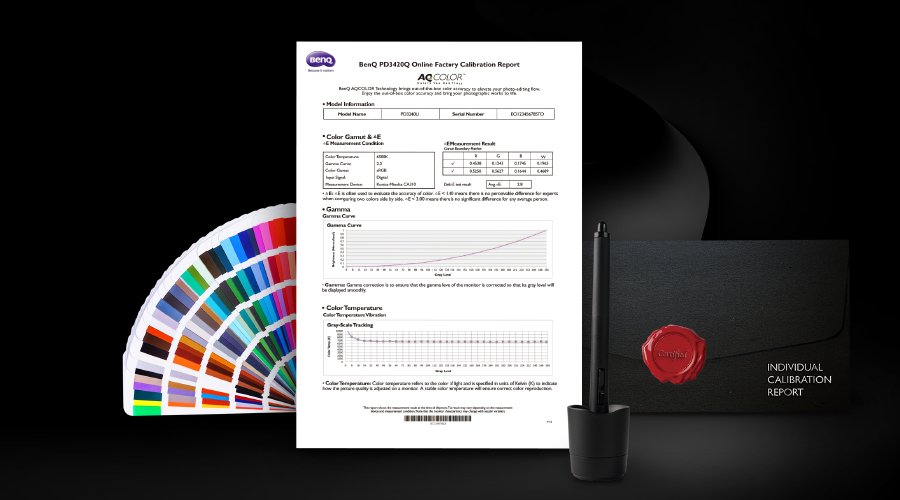
Look for monitors that support multiple color spaces (P3 / sRGB) and are factory-calibrated to Delta E<2 (a measure of color accuracy). This is especially important for concept art, texture work, lighting, rendering, UI design, and technical art. Accurate colors help each step of the pipeline stay true to your original vision.
Even high-end monitors can see a shift in their colors over time. That’s why regular calibration is important. Use an application like BenQ’s Palette Master Ultimate and a hardware tool like X-Rite i1 Display Pro to keep your monitors’ colors accurate and consistent. This ensures every workstation stays on the same page in the long-term.
Integrating a color management framework like OCIO (OpenColorIO) into Unreal or Unity helps establish a predictable and consistent color standard throughout the development pipeline. This includes color transforms (for converting between color spaces) and view transforms (which define how colors appear on different displays). With this system in place, designers and technical artists can ensure that tone mapping, gamma curves, and other color-related processes behave consistently across different workstations. This keeps the lighting, shadows, and overall visual presentation accurate, regardless of the device used. It also allows your teams to tailor outputs for both HDR and SDR platforms, minimizing issues like overexposure or color shifts when the final game is viewed on different screens.
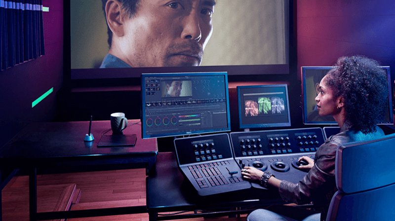
Of course, your actual monitor is the first — and most important — step in this chain.
The soul of each game can be found in its details, which is why its colors are so important. BenQ’s PD series of monitors is thus built for developers who care about precision, consistency, and creative quality. These monitors help reduce communication errors and save time on fixes so that your vision stays intact, from concept to the final build.
Want to make sure that your art is always viewed the way it’s meant to be seen? Start with the right monitor.

{{productsCount}}Result
{{displaySortType}}
{{item}}
{{item.productWordingTag}}
{{currency}}{{item.finalPrice| numberThousandsCommas | numberDecimalPoint}} Save {{currency}}{{item.saveAmount | numberThousandsCommas | numberDecimalPoint}} Save {{item.savePercent | numberThousandsCommas | numberDecimalPoint}}%
new device price {{currency}}{{item.regularPrice| numberThousandsCommas | numberDecimalPoint}}
{{item}}
{{itemTag.title}}
Compare Products
{{item.title}}
{{currency+' '}}{{item.finalPrice | numberThousandsCommas | numberDecimalPoint}}
Save {{currency}}{{item.saveAmount | numberThousandsCommas | numberDecimalPoint}}
Save {{item.savePercent | numberThousandsCommas | numberDecimalPoint}}%
{{currency+' '}}{{item.regularPrice | numberThousandsCommas | numberDecimalPoint}}
Max 4 products to compare reached.