{{item.name}}
Price: {{currency}}{{item.price| numberThousandsCommas | numberDecimalPoint}}
Qty: {{item.amount}}
By Series
4K Gaming Projectors Home Cinema Series TV Projector Series Portable Projectors Golf Simulator ProjectorsBy Feature
Home Entertainment Best 4K Projectors Best Gaming Projectors Up to 20% World Soccer Promo GV Series Portable Ceiling Projectors House Mapping ProjectorsBy Trending Word
4K UHD (3840×2160) Short Throw 2D, Vertical/Horizontal Keystone LED Laser With Android TV With Low Input LagExplore Commercial Projector
Professional Installation Simulation Projection Small Business Corporation K12 & Higher EducationBy Feature
Photographer Monitors Designer Monitors Best 4K Monitors Best Monitors for MacBook Pro & Mac Best Monitors for Versatile MacBook Users Best Monitors for ProgrammingRemote Work & Learning
Explore treVolo Speaker
Dialogue Speaker for Learning Electrostatic Bluetooth Speaker Carry Case & StandProjectors
Monitors
Lighting
Remote Work & Learning
Interactive Displays | Signage
Store

Architectural Photographer and Fine Art Printer / UK
Keith is a commercial photographer and fine art printer based in Leicester, UK covering architecture, interiors and industrial photography. His photos are often used in a wide range of publications around the world.
Keith has been trying out the latest BenQ monitor aimed at photographers and graphics professionals, wanting a wider gamut hardware calibrated display.At 24″ it’s smaller than his 32″ or 27″ preference for desktop use, but absolutely ideal for working in a more limited space or with a laptop as a main display. More info. at BenQ
Article Index
Ok, perhaps I’ve become too used to big monitors, but my first thought on seeing the SW240, was how small it was…
Then I realised that I wasn’t looking at a replacement for my big desktop stuff, but at a high quality monitor that would work in smaller spaces or as an external display for my laptop.
The new monitor is aimed at the photo editing market, complementing the 27-inch QHD SW2700PT, the 27-inch UHD SW271, and the 32-inch UHD SW320 – Links are to my reviews
I’m looking at the standard version without the hood.
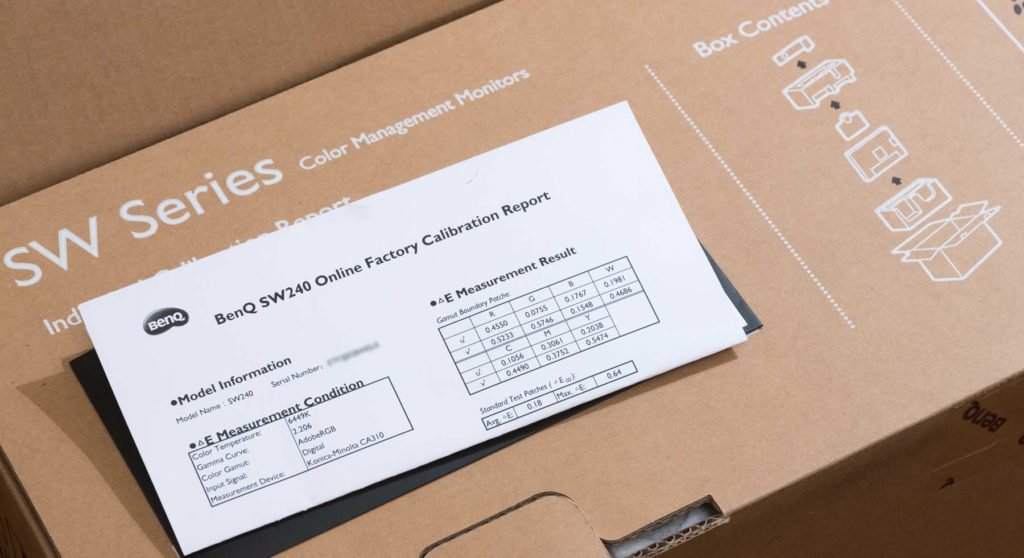
The monitor is well packed, and on opening you get the monitor’s own calibration certificate.
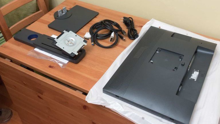
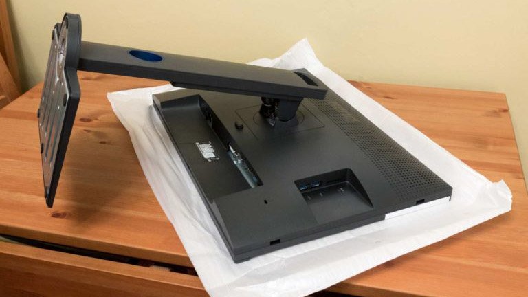
The monitor only takes a few minutes to assemble and connect up.
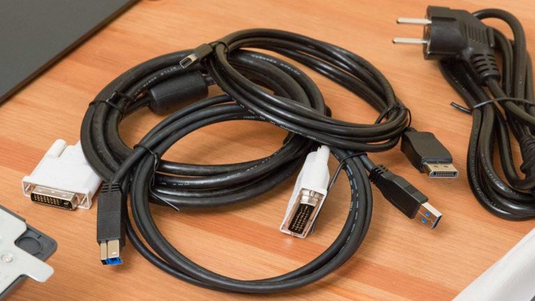
First up a quick check of the box contents.
You’ll note that I’ve used the bag for the display to protect it and the table from marks.
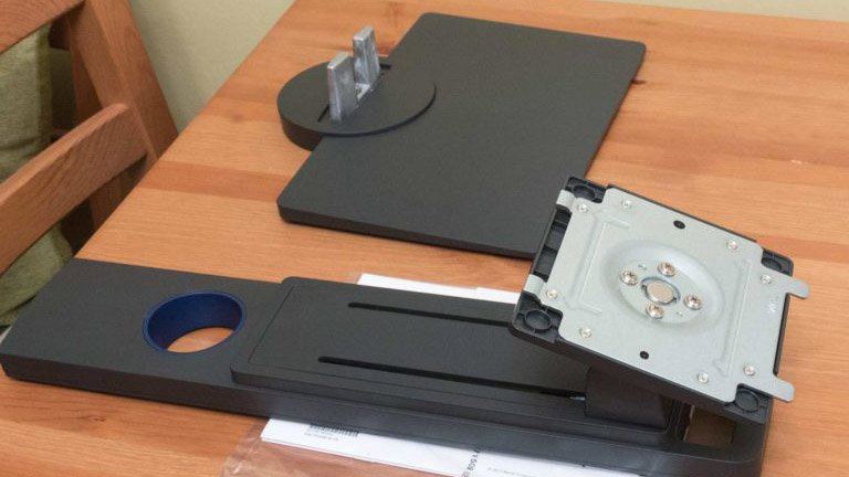
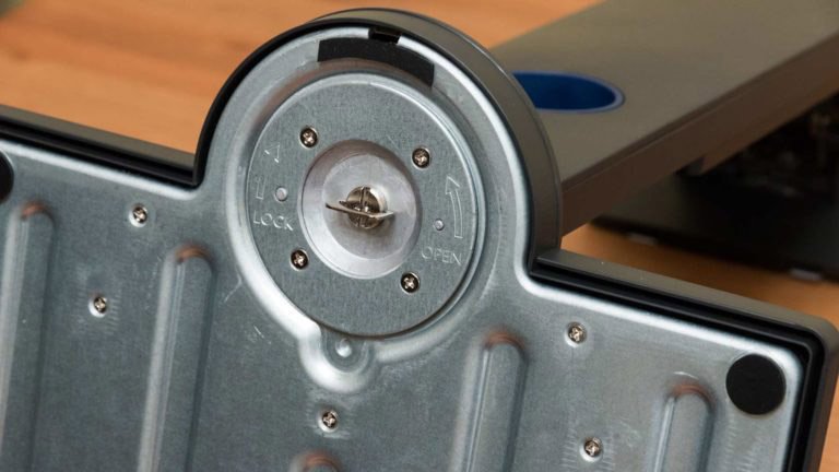
The stand comes in two parts.
The two slot together.
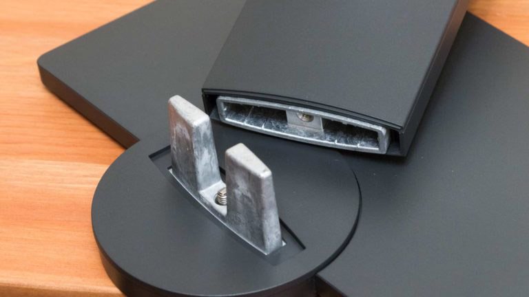
The screw can easily be tightened by hand.
The panel mounting plate then simply clips into place at the back of the screen.
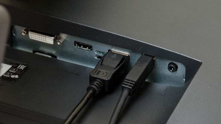
A good set of leads – even if I have to swap the power lead I’ve got for a UK plug version.
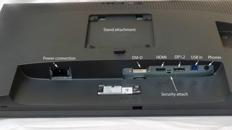
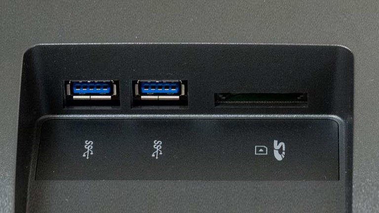
All the connections at the base.
There are two USB-C sockets at the side, along with an SD card reader.
I just need the DisplayPort lead and the USB lead for my MacBook.
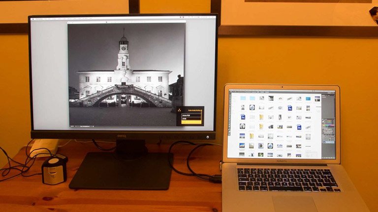
Here it is set up and working (in black and white mode).
The whole process would take not a lot more time than it has for you to read this.
(BTW, the room is orange because of the halogen lighting – I’ve white balanced shots to the screen)
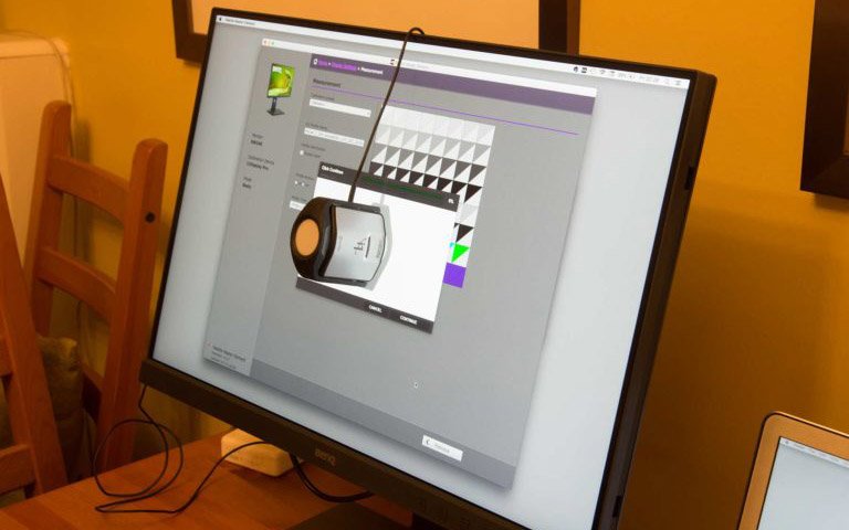
The display worked just fine with my oldish MacBook Pro, whether in landscape or portrait mode. You’ll notice the device to the left – this is an X-rite i1 Display Pro /Calibrite ColorChecker Display Pro calibrator [review] that I used for initial screen calibration and profiling.
Before using any new monitor I like to make sure it’s set up correctly and that means profiling and calibrating it.
Remember that profiling is measuring the characteristics of the monitor (how red its deepest red is for example) whilst calibration involves setting it to a known state (its whitepoint or maximum luminance for example). These two terms are often used interchangeably, but remember that they do actually refer to different things.
BenQ supply free software that allows for the monitor’s internal hardware calibration to be set up. Hardware calibration tends to be superior in that it allows for much more precise setting of monitor characteristics, and can give a smoother more consistent output.
This is a feature that used to be confined to very high end monitors, but is pushing its way into more economical (better quality) monitors.
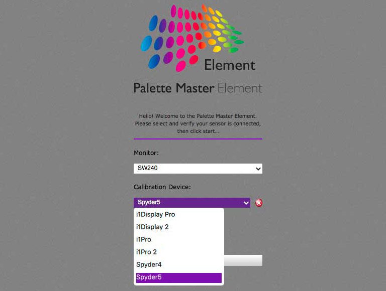
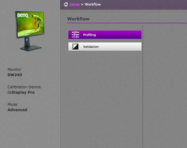
The Palette Master Element software (Mac and PC) supports a number of different measuring devices.
No ColorMunki support I’m afraid – You’ll need to complain to Calibrite, not BenQ about that though, since they don’t make drivers available to third parties.
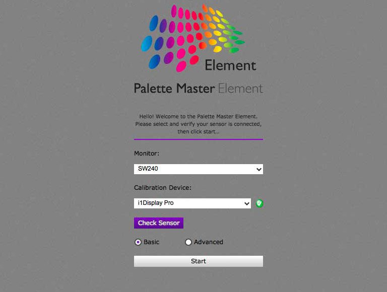
The software has basic and advanced modes. The main difference is that you get more options for the advanced mode.
I’m using the i1Display Pro device – the software will let you check that it’s connected.
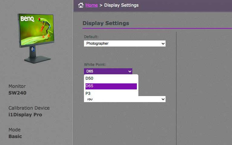
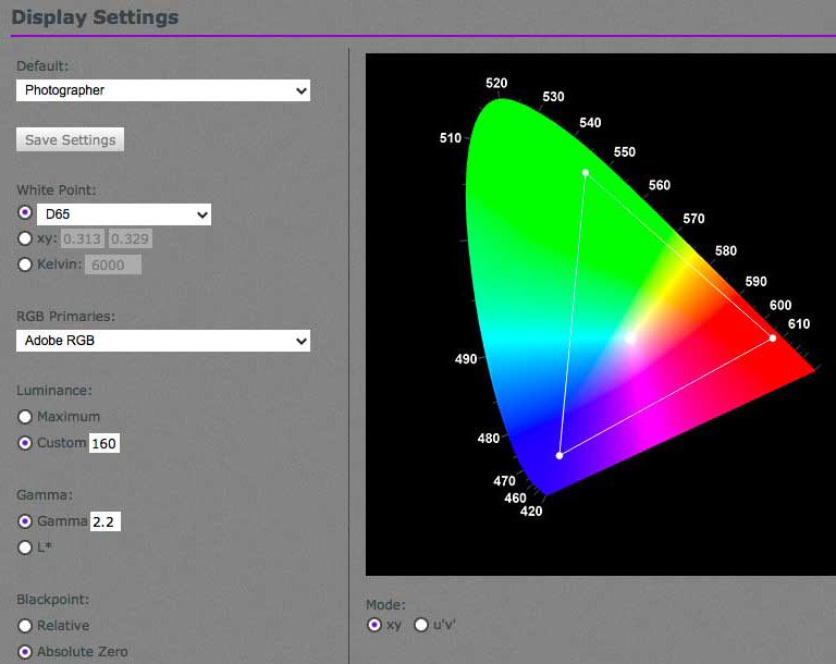
There are default groups of settings such as the ‘photographer’ one here.
I can change the white point as I see fit.
I’ll come back to a discussion of my personal choices for settings later.
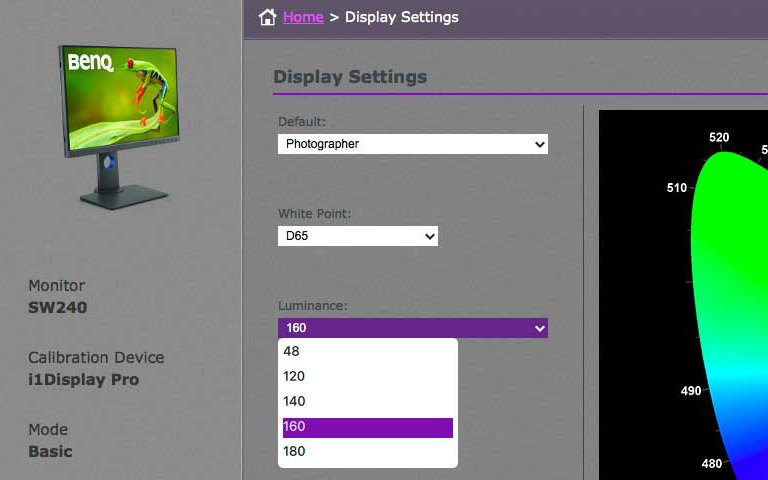
I can choose how bright I want the screen too.
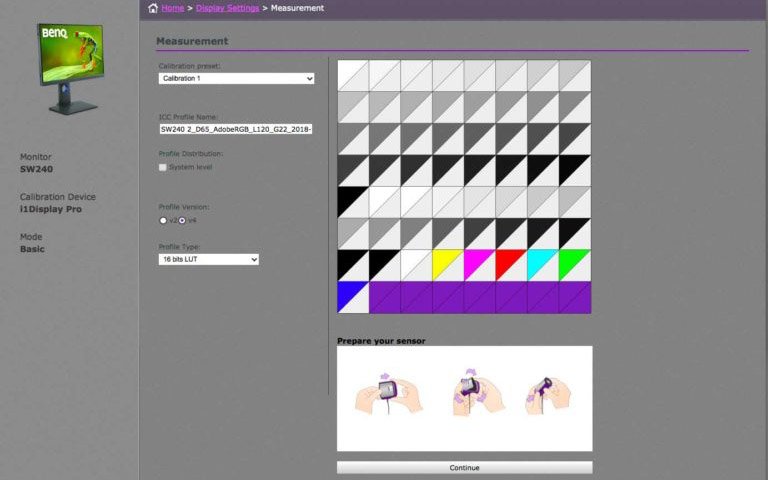
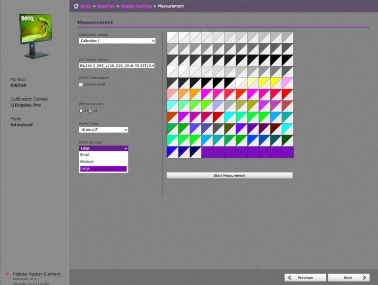
Once I’ve decided on the settings, I move to measuring the screen characteristics.
I need a name for the ICC profile generated – the suggested one contains the various settings and will do just fine.
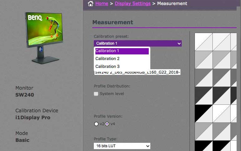
I’m actually saving this calibration set to one of the custom ones (I’ll come back to these choices).
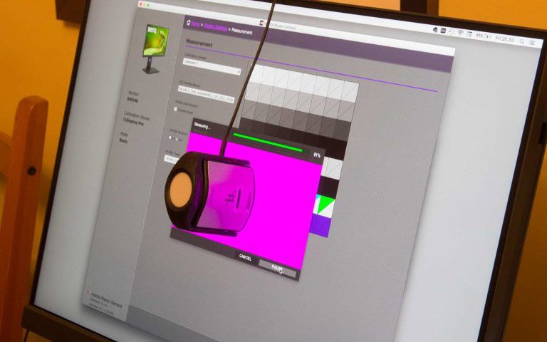
Once I’m ready to take the measurements, I just hang the sensor over the monitor.
With the MacBook Pro I need to set the screen brightness manually, but on other systems it’s automatic.
Once the brightness is set, the screen displays various greys and colours, whilst the the i1Display measures them.
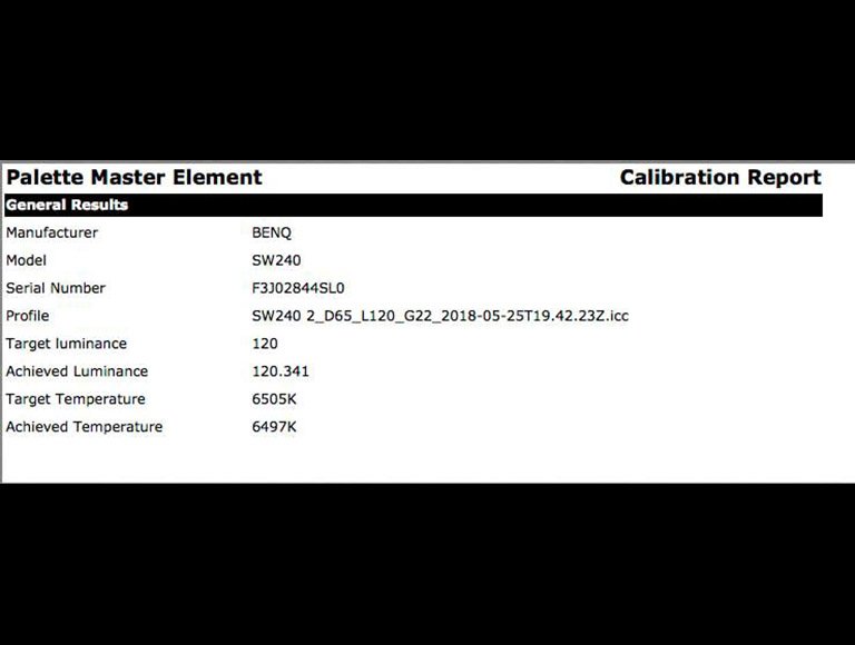
After a few minutes, the process is finished.
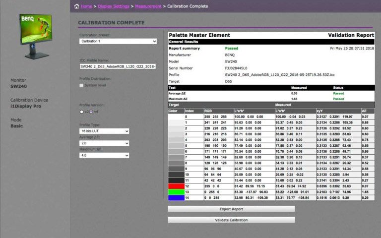
You can run a validation check – some more measurements are taken and you get this report.
I’ve used the Adobe98 gamut setting of the monitor here.
The calibration/profiling process work just the same with the advanced mode, you just get a few more options and the workflow is slightly longer.
If you’re new to setting up such monitors, don’t get too concerned about all the options.
I’d suggest that if you take the approach that a ‘default setting you don’t understand is one that probably doesn’t need changing’, you won’t go wrong to start with.
Take these ‘photographer’ settings for example…
Nothing too bad about selecting D65 and Adobe98.
Personally, I find 160 cd/m2 a bit bright for my editing choice. I’d prefer ~120 or even 100 if I’m working in a darker room and editing for prints. It does depend on just what sort of environment you’re working in, but remember that having your monitor too bright is one of the most common reasons for dark prints.
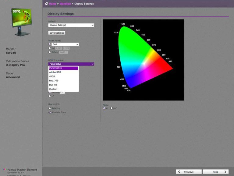
You can also set the RGB primaries to the best the display can do (native) or other specific settings.
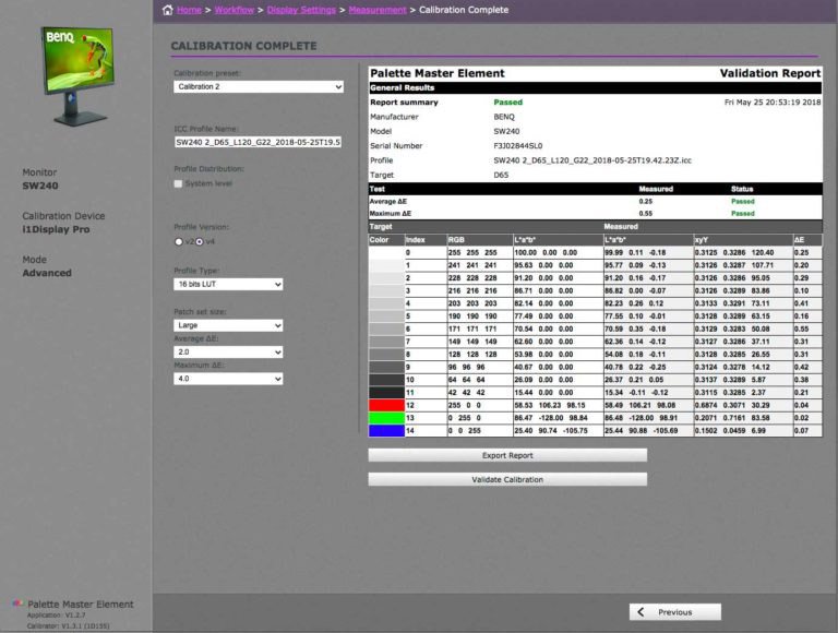
You can specify a larger set of target colours to measure.
The measurement process is just the same and when completed you get the chance to run the validation step.
Note how I’ve saved this particular configuration to ‘Calibration 2’.
The validation report (info as above) can be saved as well.
As I mentioned, the default ‘photographer’ settings of the monitor are not going to be an issue for many people using one.
However, my own preferences are to fine tune things a bit for my work.
D65 at 120 is fine for my day to day editing, where I’m often supplying images for web use. I use the panel’s native gamut settings to get the best range of ‘real’ colours it can manage.
I generate the 16 bit LUT versions of profiles since they give a marginal benefit on my Mac.
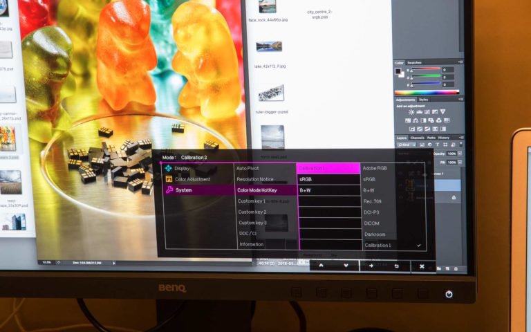
One of the features of the SW240 is that you can quickly switch between stored calibrations via the on-screen display.
The quick selection button offers three settings to be used.
The standard setup includes a B&W mode for the screen – I do a lot of B&W work, so prefer to do conversions from colour to B&W under my control. That lets me cut out that one.
My own set of three ‘quick select’ options are:
With my Macs, there is one thing to note about swapping calibrations on the monitor. Swapping the calibration does not change the active ICC profile for the screen. The ICC profile is what applications (such as Lightroom/Photoshop) use to ‘know’ what to display.
This means that if I swap from C1 to C2 I need to swap the active profile in my System Preferences – this is why meaningful profile names matter.
For the ‘quick sRGB check’ I don’t bother, since web display colour management still remains an area of unpredictable mystery (made worse by phones).
For video, you might want different settings groups, but the nice thing is that you have all the options.
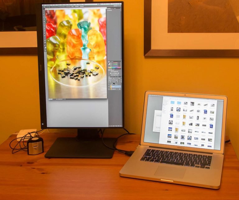
A very nice monitor to use.
The matt screen surface is good at handling extraneous light, as you can see from the print frame and glass behind the screen (note a bit of moire on the screen – a camera artefact).
The IPS screen is pretty even, with only a slight falloff along the very bottom of the screen I tested. Even that is much less noticeable if you’re properly square on to the screen.
I use a monitor hood with the main monitors in my office, so did wonder if I’d notice the lack of one with the standard SW240.
Not too much actually – reminding me that I never used one for the first 25 years of my image editing history.
The BenQ hoods fit very easily (see my other reviews) but I’m sure that if you’re really on a tight budget and wanted to use the SW240 in a bright environment, you could make one from black art board ;-)(Note – At the time of writing, I see the SW240 being offered in the US with a free hood)
In these days of super high resolution screens, I’m going to say that for general working I prefer the lower PPI of this 1920 pixel wide screen. I don’t do 4k or 8k video and have no desire to watch video/TV content on a screen that close to me.
I need glasses for screen use and find that current implementations of content scaling for high DPI screens don’t work well enough. I know that when Karen tested the 4k SW271 (see my SW271 review) on her Mac she found that at 27″ she preferred to set the resolution to 1920 wide (with super fine 4k HDR as and when actually needed).
I suppose I’m saying that you don’t need to jump on the 4k bandwagon just yet – at least not at 24″ width.
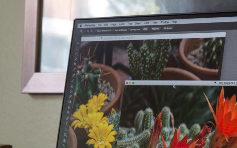
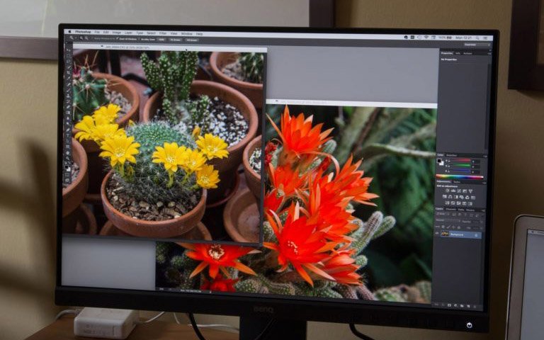
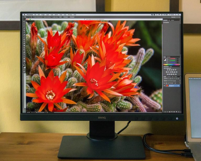
It’s difficult to show the real benefits of a wide gamut monitor in a web article, but the image of the cactus flowers in our conservatory made it really clear
The insides of the red flowers show almost no structure when viewed on my laptop screen, or with the SW240 set at sRGB.
Move to A98 (or ‘native’ as I had it set) and there is clear detail in those intense reds.
A different view (slightly different white balance) shows some of the detail, but for both these examples I’ve had to turn down the saturation when processing the images for display here, on the web.
The use of a larger gamut also brings out more detail and depth in those dark background greens/browns.
As you’d expect, printing this image raises all kinds of issues.
Update: I’ve written another article covering the editing and printing of bright colours in photos.
The monitor has a useful range of inputs, with the two USB sockets and SD card reader at the side being helpful, although a little tricky to reach without access to the back of the monitor.
The screen is quite elegantly styled, and it was only when I looked at some older monitors I realised just how thin that edge was.
It’s interesting to see what were once the specifications of really high end monitors making it into the broader market. If you take care with your approach to colour management, stepping up to a monitor like this can make a real difference to your photographic output and print quality.
It’s a monitor I’d be happy to take with me when explaining the benefits of colour management to clients, if just to show the clear difference between the MacBook display and the SW240 for those red flowers.
Photographer Monitor with 24.1 inch, Adobe RGB | SW240
Get One Free Year Pantone Connect
{{productsCount}}Result
{{item}}
{{item.productWordingTag}}
{{currency}}{{item.finalPrice| numberThousandsCommas | numberDecimalPoint}} Save {{currency}}{{item.saveAmount | numberThousandsCommas | numberDecimalPoint}} Save {{item.savePercent | numberThousandsCommas | numberDecimalPoint}}%
new device price {{currency}}{{item.regularPrice| numberThousandsCommas | numberDecimalPoint}}
{{item}}
{{itemTag.title}}
Max 4 products to compare reached.