The display world has been abuzz the past couple of years with the term “display P3.” In fact, this technology has revolutionized the industry and the user experience, too. This is not only because Apple® has been incorporating Display P3 panels in its iMac®, MacBook Pro®, iPhone®, and iPad Pro® devices, but because even Microsoft Surface Studio desktop computers and Android mobile phones and tablets have begun to feature the technology, moving it closer to ubiquity. A quiet revolution has taken place in the display industry. Therefore, it is crucial for creative designers to take a look at their workflow and understand why they need to incorporate a Display P3 monitor into their creative efforts.
What is Display P3? Display P3 is a combination of the DCI-P3 color gamut with the D65 white point together with the sRGB gamma curve. It originated from the DCI-P3 color gamut’s implementation in digital cinema projectors, as this standard offers more vibrant greens and reds than the traditional sRGB color gamut. The white point of the original DCI-P3 is tinted green, and the gamma curve is 2.6. These parameters made it suitable for theater viewing, but not for closer viewing, such as on monitors. Hence, Apple® proposed changing the white point to D65 and the gamma curve to the sRGB curve, and named the new set of attributes “Display P3.” Since its color gamut is larger than that offered with sRGB, Display P3 is considered a wide color space.
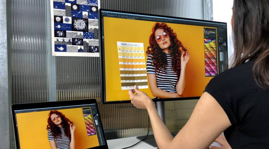
Why should this matter to designers? For one, it is important for them to consider how their work is published and viewed in real life. Twenty years ago, creative works were mainly distributed through hardcopy prints. Today, illustrations and photographs are mainly delivered electronically. So it makes sense to craft artworks on a display that reflect the conditions where end-users will actually be viewing them. If a work will be printed, designers should view their works on an AdobeRGB monitor to best simulate CMYK printing. However, if artworks are mostly being viewed on Display P3 compatible devices, then they should be previewed on a Display P3 monitor.
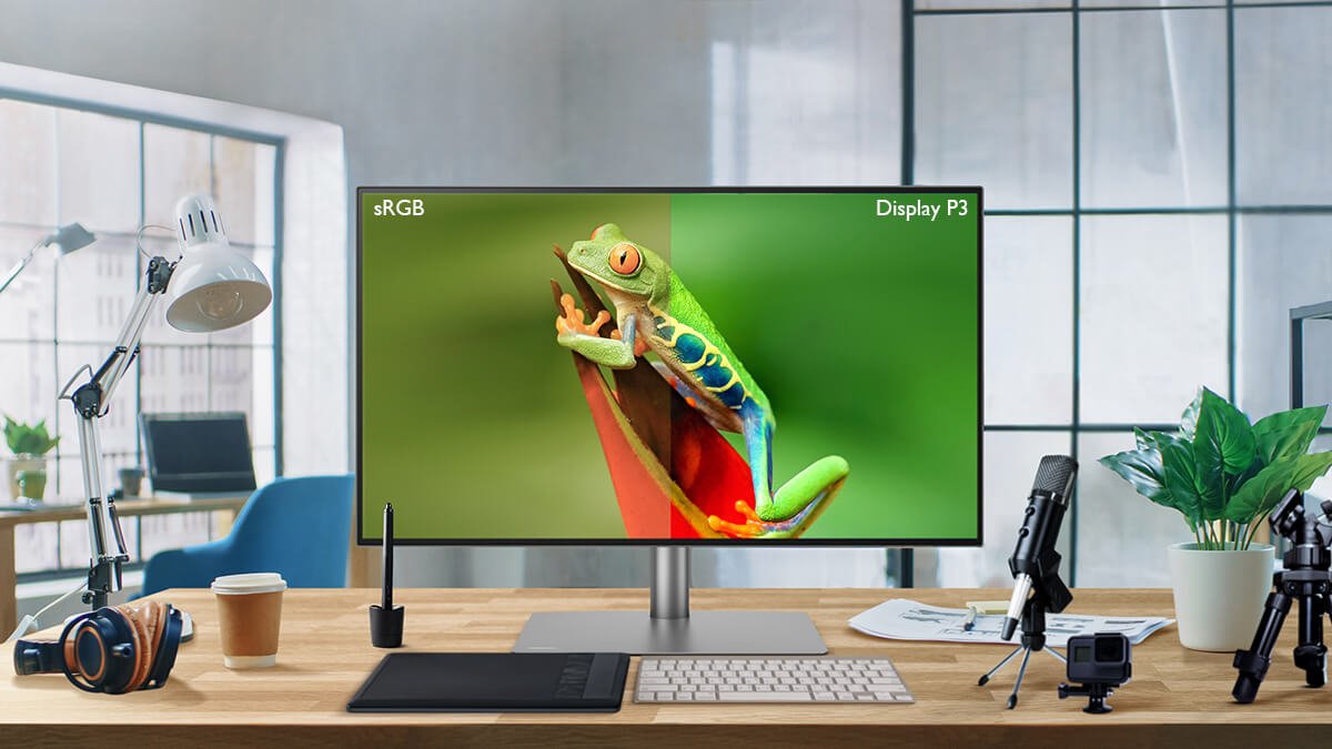
Why is a traditional sRGB monitor not up to the job? An sRGB monitor may not deliver the vibrant colors a Display P3 device can produce. An example can be seen in Fig. 1. On the left are colors a Display P3 monitor can reproduce, on the right are those an sRGB monitor can reproduce. It can be readily seen that the colors on the Display P3 monitor are more vibrant, in particular the greens and reds. Looking at Fig. 2, a similar observation can be made concerning the u’v’ chromaticity diagram where the Display P3 and sRGB color gamuts are plotted together. The Display P3 color gamut captures more of the red and green areas, and extends further. This means that Display P3 is capable of displaying more variations of red and green shades, and of exhibiting stronger reds and greens.
Therefore, if images are edited on an sRGB monitor and look right to a designer, then they will appear oversaturated on mobile devices. Skin tones, for example, could be disastrously misleading if overly saturated in a picture.

Fig. 1: Photograph rendered in Display P3 and sRGB.
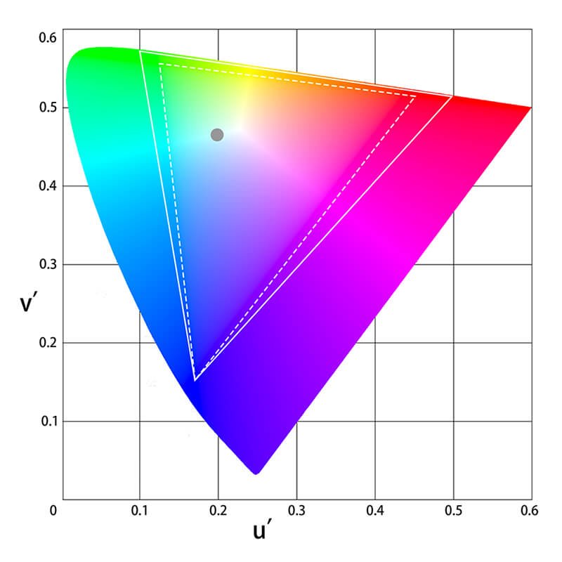
Fig.2: CIE 1976 Display P3 and sRGB Compared in CIE u’ v’ Chromaticity Diagram.
There is another important incentive for designers to utilize Display P3 monitors in their workflow. In CSS 4, a wide color gamut such as Display P3 is supported and is being implemented by Chrome and Safari browsers right now. This means that web browsers will finally support a color gamut larger than sRGB! This is very encouraging news, and a major step in color communication over the Internet. We will no longer be restricted to the sRGB color gamut when posting photographs or designing websites, as Display P3 can be used to showcase more brilliant, true-to-life colors. So there is ample reason for designers to begin utilizing Display P3 monitors in their work. It is simply not possible to view the saturation and colors of hues the Display P3 color gamut is capable of on an sRGB monitor. For these reasons, it is time to step up the color gamut on your monitor!
Display P3 is a wide color gamut used extensively in mobile devices, such as mobile phones, tablets, notebooks, and certain late-model desktops, such as iMacs® and Surface Studio desktop computers. Compared to sRGB, Display P3 features more richly saturated red and green colors. More and more devices are incorporating Display P3 panels in their devices, so it is reasonable for designers to use Display P3 monitors when creating their art. An sRGB monitor cannot reproduce the vibrant colors Display P3 intends. Therefore, now is the time to swap your old sRGB monitor for a Display P3 monitor!
Learn About How Monitor for Mac® Users Are

Apple®, iMac®, MacBook Pro®, iPhone®, and iPad Pro® are trademarks of Apple Inc.