Introduction
We recently sat down with Chris Bai, BenQ’s Senior Color Expert to talk about the importance of color and the development of our different color technologies.
Chris has PhD in Color Science and is one of the chief ISO experts for the graphic arts industry. He is currently the Vice Chair of the Display Working Group of the International Color Consortium (or the ICC).
What are your responsibilities as the vice chair of the ICC?
Basically, the ICC develops color standards for all industries. We meet three times a year to discuss a lot of color problems that we encounter every day. For example, why the colors of printouts don't match the colors shown on displays, or why one display renders colors differently compared to other displays. We try to develop solutions to tackle these kinds of problems using ICC profiles. We talk to a lot of different manufacturers and companies to let everybody agree on solutions.
As the vice chair of the display working group, I make sure that the latest color trends in display technologies are incorporated into current color standards and then make sure that all those standards work with all industry partners.
Can you tell us what drew you into color science?
This is a very interesting question. I’ll say it was photography, more specifically digital photography. When I first bought a DSLR—it was almost 20 years ago—I was really naïve. I thought all the colors would be the same no matter where it was reproduced. When I shot photos and looked at the camera’s monitor, what I got to see was one kind of color. But when I transferred the image files and looked at them on my computer monitor, they were very different. And then when I printed them out, it was a totally different story. I wondered… They should be the same, right?
And then I did a lot of research. But at that time, there weren’t a lot of resources about digital color. One particular term that always popped up was “color science”. I figured that color science may be the answer to this whole problem, so then I devoted myself to this field of study and earned myself a PhD.
What does it take to become a color expert? Do you need any specific certification?
I wouldn’t say certification, but first, you have to have normal color vision. If you have any kind of color deficiency, it will impair your judgment of color, so normal color vision is a must for color experts. Then you have to go through a lot of training for your sense of color sensitivity. We need to do a lot of color comparison to judge which hue of color this is, what's the difference between this color and that color. Can you tell even if it’s a very minute difference? We went through a lot of these kinds of training.
Importance of color
So why is color so important?
Color can tell us a lot of information. It can tell us if food is safe to eat or not. It can tell us if fruit is ripe or unripe. It can also tell us a lot about someone’s personality, from the color of clothes he or she is wearing.
It’s also very important in different fields of applications. For example, in shops, you need bright and contrasting lighting to show off the color of your merchandise. This way, people will be more likely to buy the merchandise you're showing off. Or in some cases, like in meetings, if the content of your slides is more vibrant and has more saturated colors, then people are more likely to be drawn to your presentation. They won’t fall asleep. They'll be more excited and be more likely to pay attention to your speech.
And I want to add, when you’re presenting colored content, it has to be delivered on a display which can show off colors accurately. Because no matter if you have really good colors in your content, if your display can’t reproduce them accurately, then it defeats the purpose.
BenQ color
People may not know this, but we actually have a color technology lab at BenQ. Can you tell us what you do in the lab?
Yes, we do have a color technology lab at the BenQ headquarters, and this really sets us apart from other brands because we focus on color technology… We do a lot of research in color science. So, for example, we look into different color combinations and see how they’re received by different genders or different regions.
Our lab is basically a huge dark room. It’s a good place to test what works under different illuminations so it lets us calibrate colors more accurately. We calibrate the color settings of monitors, displays, projectors... We find ways to integrate our product lines together. For example, we match the color between projectors and displays… We basically do things like that.
What considerations go into designing the color settings for BenQ solutions?
When we design the color settings for the displays, we do a lot of testing. So, for example, when we decide what we would like to have for a particular setting, we try to break it down into parameters. We formulate it and then test it with a small test group. If they are satisfied, the setting gets released.
And then we collect the feedback from the customers. We see if they like it, what kind of features they like... If there's something that we need to improve, then we apply the changes to the next version. So this is an ongoing process.
Pantone® color
Speaking of color settings, one of the key color modes we have for the SL series—which we also integrated into X-Sign Designer and some of our monitors—is the Pantone® color mode. What is the significance of Pantone in the industry?
Pantone is a big deal for designers because it's a color communication tool. Think of it as a deck of color swatches that designers use to communicate worldwide… There's a number associated with each color so it’s easier for them to know which one they're referring to.
The deck of color I'm talking about is normally a physical copy. It's on paper or on plastic or on fabric. It's hard to carry around. But everything right now is digital, so our Pantone mode is designed specifically for everything displayed on screen. Pantone mode can display all the Pantone colors very accurately.
When we say Pantone color mode, do we mean we’re only using the colors found on Pantone swatches?
When validating colors for the display, we need reference color values. And the Pantone color swatches, those are known values. We base the Pantone color mode on those swatches and use those to validate the accuracy of this color mode. But it doesn’t mean the color range is limited. The mode can also display other colors as well. We just use Pantone color swatches as a reference so we can be confident to say that the colors are represented very nicely and very accurately.
BenQ color modes
We also have the M-Book mode, which stands for MacBook. Why is it so important for us to have this mode?
We understand that a lot of designers are using MacBook, and MacBook has its own color profile. And… This is actually from our customer feedback… Our customers wanted to have their MacBook—which is a small 12- to 15-inch screen—extended to a much larger display. So that's why we had this idea to simulate the same colors on the MacBook on the SL. This gives them a larger viewing area so they can work more efficiently. This is what we call extending the workspace. We can have consistent color across both screens.
We also have the other two modes: Cinema and Photo mode. What is the main difference of these modes to the default color mode of our BenQ displays?
The Photo mode is designed for viewing still images, and Cinema mode is designed for moving content. We designed the Photo mode to have a little bit more saturated color. But we do so in a way that it still gives you something natural, so it's not overly saturated like cartoon colors. For Cinema mode, the images are moving, so we try to avoid having jittering or other unsmooth moving artifacts.
To close things off, can you tell us about what we can expect from the BenQ color team in the future?
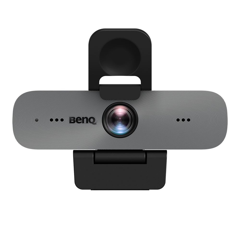
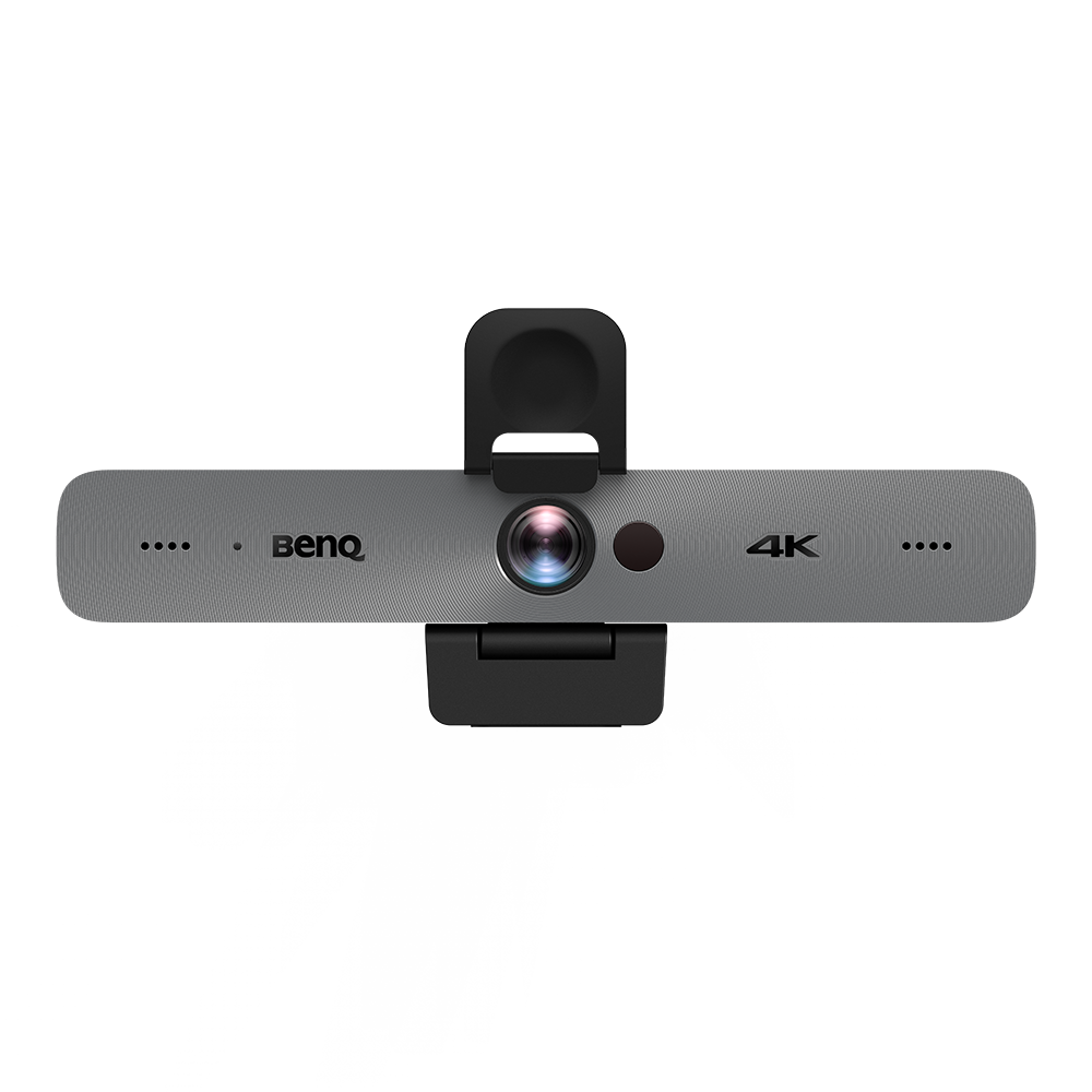
Yes. As a matter of fact, we finished two very interesting projects. One involves the conference cameras (DVY31 and DVY32) and the other is for the video bar (VC01A). For these two projects, we did a lot of color adjustments.
We solved the common pain point of cameras not being able to reproduce colors very faithfully. Many conference cameras today don’t really have a good reproduction of skin tone. They often have this yellowish or greenish tint to them. They don't look good. We solved this using our color adjustment techniques.
If you have a chance, you definitely need to check out these products, and you'll find a great improvement in their range of colors. I think that's all I can say for now.
Portions of this interview have been edited for brevity and clarity.