{{item.name}}
Price: {{currency}}{{item.price| numberThousandsCommas | numberDecimalPoint}}
Qty: {{item.amount}}
Job References

This copy is originated from Michael B. Rehders’s Blog Posting: BenQ Color Management Displays – For true-to-original colors
As a photographer, it should always be your goal to enable viewers to see your elaborate works of art in the way you intended. One of the most important tools for this is a good Color Management Display.
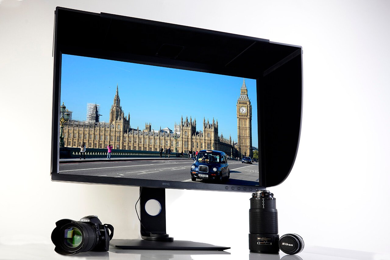
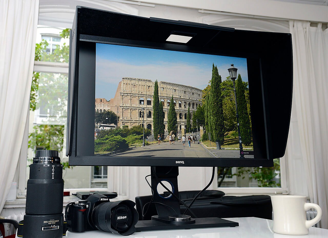
Photo: Michael B. Rehders – The BenQ SW320 is an affordable 4K professional monitor with a 31.5 inch diagonal that is suitable for photographers and film producers to process high-resolution images in the correct color.
Have you already received prints from the laboratory and asked yourself what was supposedly wrong there? – The great summer shots under a radiant blue sky look unnaturally pale. The sun-tanned skin of your holiday companion's skin appears cancer red, and the black and white pictures have an unattractive green tint?
But you've looked at the photos before: On the display of your camera. On the monitor of your notebook. On the screen of your computer. And that's where the colors look extremely natural – or maybe not?
As a photographer, I learned early on that beautiful colors are not a matter of taste.
If my customers are to see the elaborately produced artwork as I intended, all people involved in the workflow must use the same standard. The photographer, the graphic artist, the printer and in film productions even the cinema owner, if only one of these people believes that they can deviate from the prescribed standards, this will have a negative effect on the final result.
For this reason, Color Management Displays – i.e. professional monitors – are available to show the artwork as it should appear later.
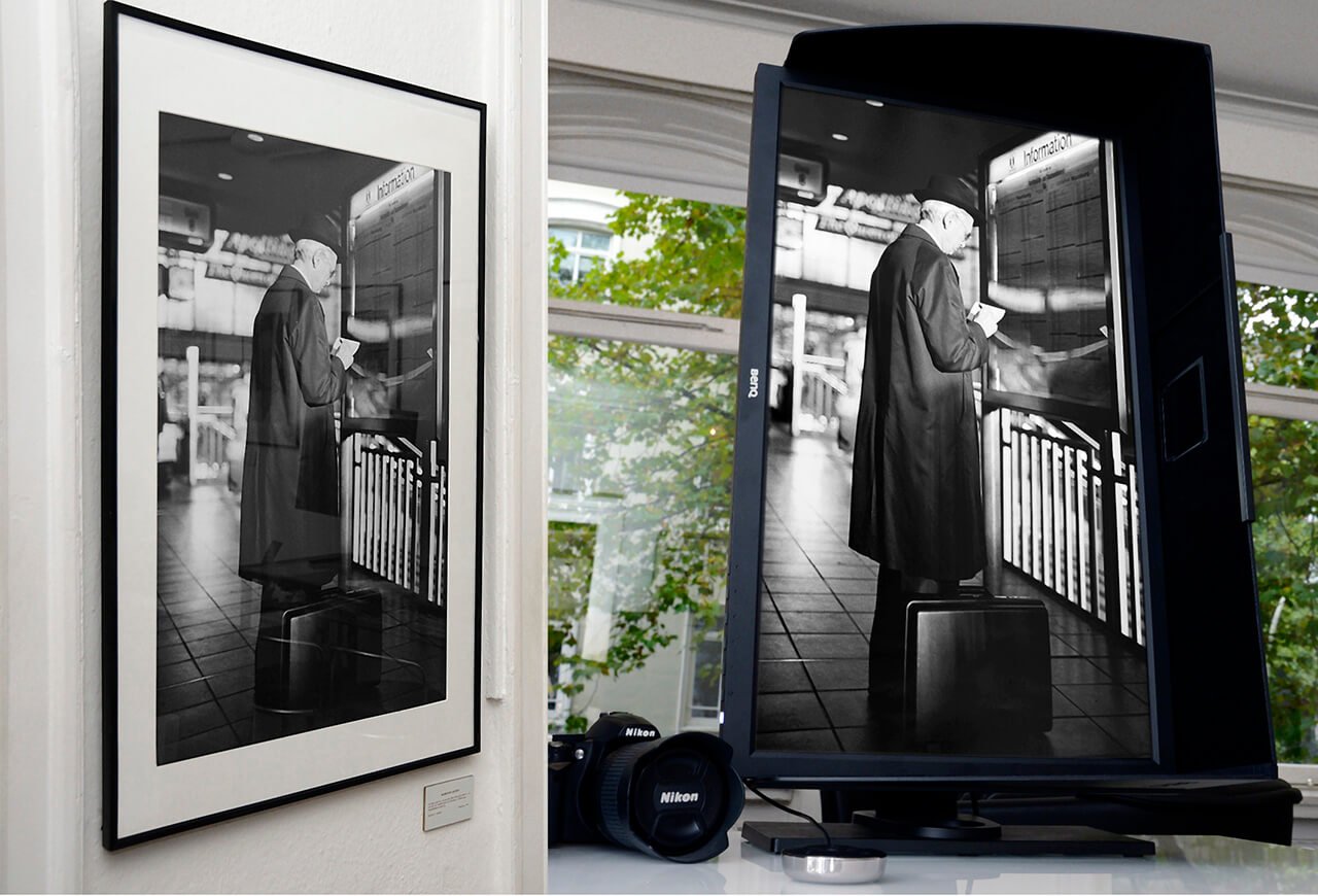
Photo Michael B. Rehders – On the left you can see the framed black and white picture in my exhibition. On the right, the edited photo is shown on the BenQ Color Management Display. It’s good to see that all the details of the original image are available on the print. In addition, the print and monitor display appear to be completely neutral in color. This is how an optimal workflow looks like.
I think it is important that the Color Management Display has excellent factory settings. To illustrate this, I have measured several screens.
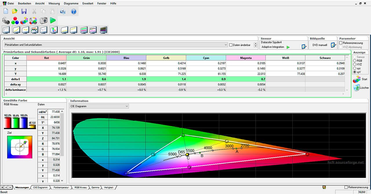
BenQ SW2700 color space ex works – The measurements confirm that the delta E values of the primary and secondary colors are all in the green area. The gamut hits the target coordinates almost exactly.
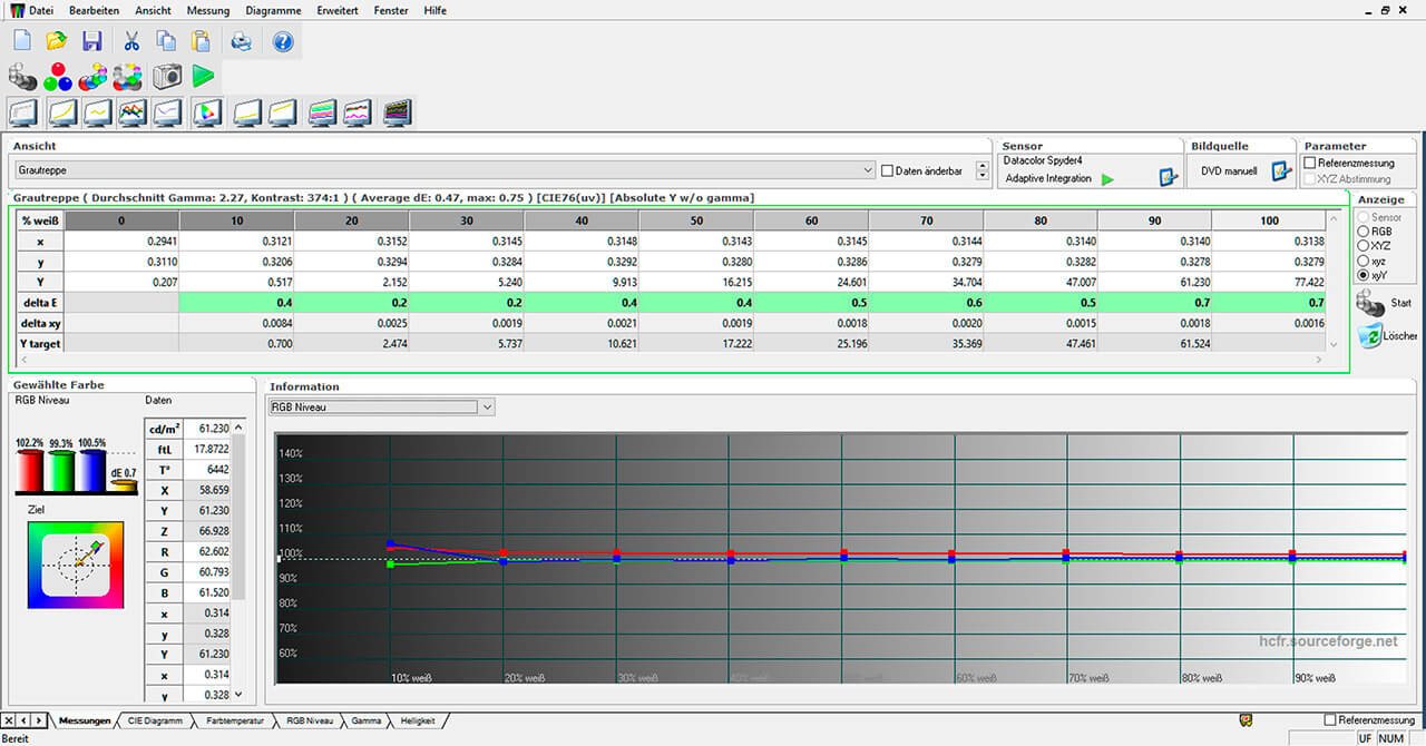
Grayscale gradient of the BenQ SW2700 – The grayscale gradient from black to white is virtually perfect. There’s nothing to criticize here either.
In practice, the excellent delivery condition of a screen pays off, as can be seen in the above black-and-white photo. But color photos also benefit from this to the same extent.
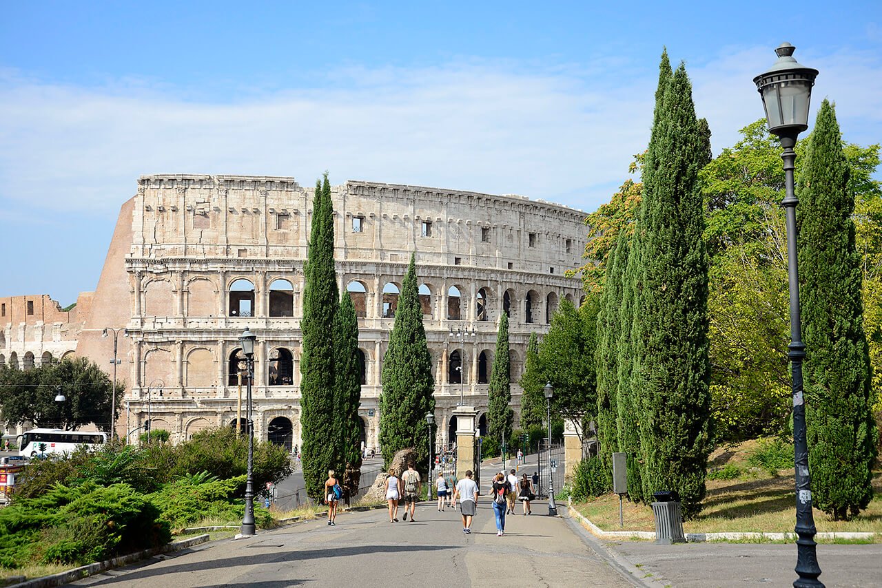
Colosseum – Photo: Michael B. Rehders, Rome 2016
I shot the original image last year in Rome. The trees and shrubs have the finest shades of green. The color gradient in the sky is also extremely homogeneous.
Photo: Michael B. Rehders – BenQ SW2700PT: The screen displays all color nuances in detail. In addition, the screen reproduces the finely differentiated clouds
Today, there are hundreds of color models for different purposes. Basically, all of them are based on the CIE standardized valence system developed in 1931 (CIE 1931). If you take a look at the menu of your camera, you'll soon see two color space profiles: Namely Adobe RGB and sRGB.
These color space profiles enable the "recording" of differently saturated colors.
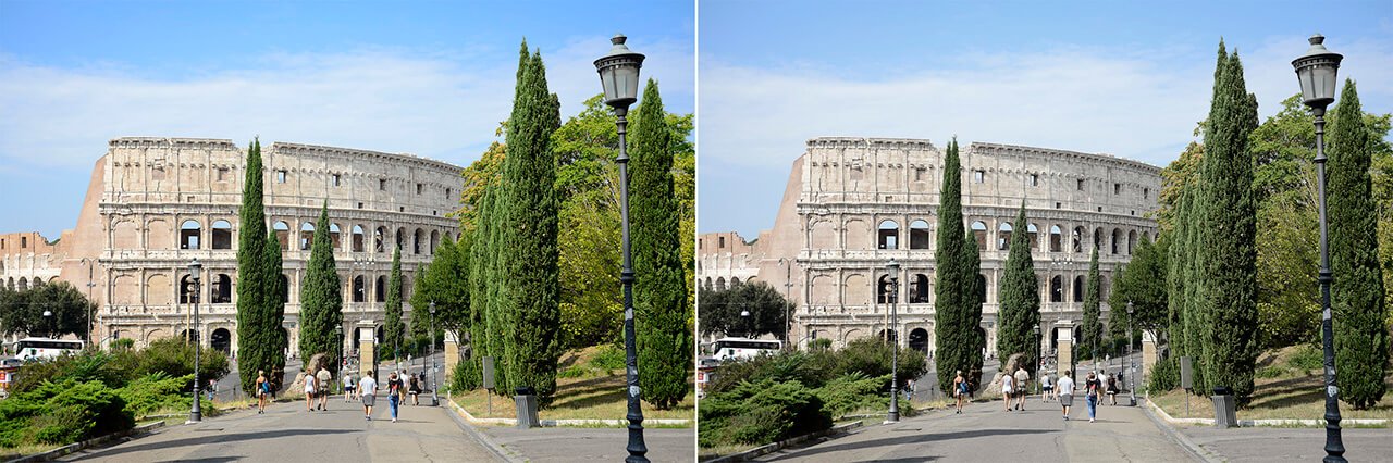
To illustrate this with two photographs:
Colosseum Rome – Photo: Michael B. Rehders, Rome 2016 – On the left is the image with the color profile Adobe RGB. On the right it can be seen in the color profile sRGB.
It is already visible to the naked eye that the color spectrum of the image is limited in the sRGB color space. The result is less lush green and cyan.
This comparison shows how important it is to use the right color model in image processing when reproducing images true to the original.
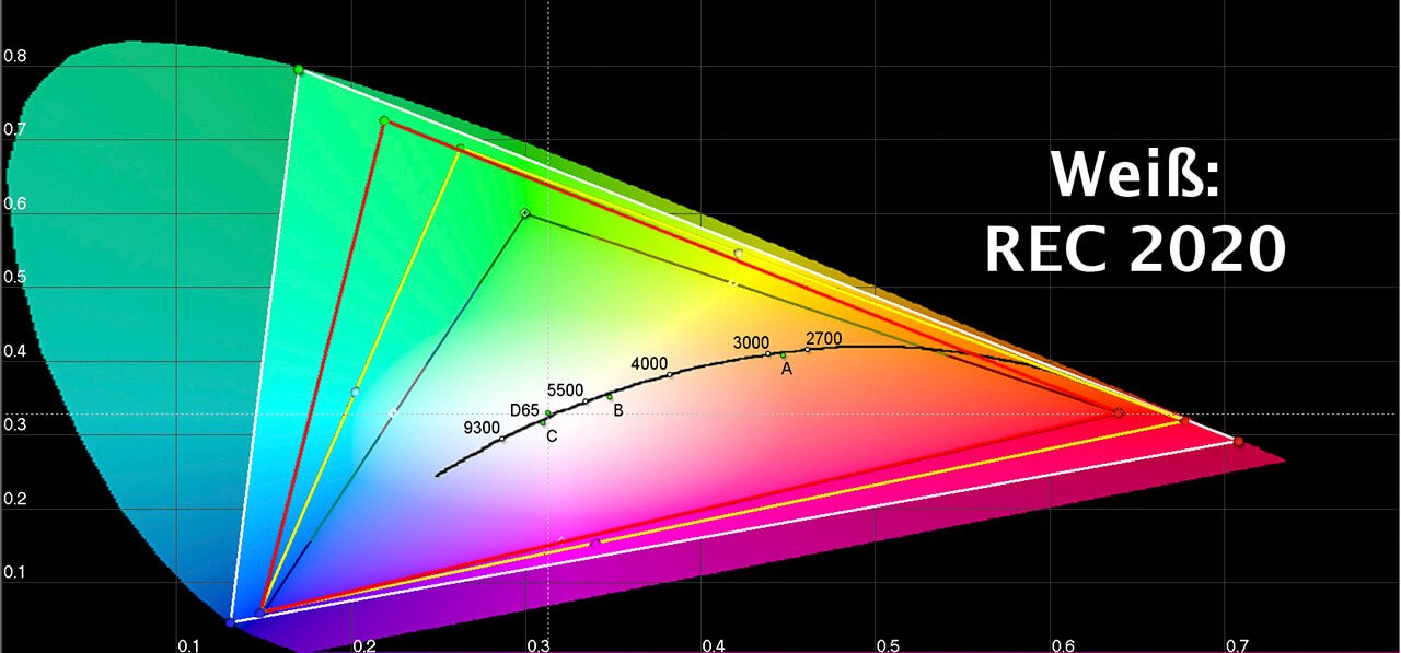
The following color model diagram explains why this is the case.
The colored "horseshoe" shows the complete spectrum of colors that the healthy human eye can perceive. The colored triangles in it depict the color spectra used by the following standards that we find everywhere in film and photography today: sRGB (Black), DCI-P3 (Yellow), Adobe RGB (Red) REC.2020 (White) It is striking that there is no color standard that covers the complete color spectrum from 320 to 720 nm (Nanometer = unit of measurement).
The sRGB color space is the smallest. The REC.2020 color space is the largest; however, there is currently no content available that uses this broad spectrum. The Adobe RGB color space is much larger than the sRGB color space. Since photographic laboratories use this color space, much more differentiated nature photography is possible (see above).
The DCI-P3 color space is used by both the cinema and the brand new 4K Blu-ray. So it's good if the monitor can also display this color space, for example, if the user edits movies for the cinema on it.
Photo: Michael B. Rehders – BenQ SW2700PT: This is a photo I took for a raffle. The wonderful gold colors are perfectly accentuated in the Adobe RGB color space. This is the result if all people involved in the workflow comply with the standards.
Why does a screen need to be calibrated if it is already displaying true colors? - Unfortunately, not all players output correct colors. Above all, many graphics cards in PCs distort the original visibly. Similarly, almost all notebooks output faulty image signals at their HDMI and DisplayPort outputs; unfortunately, this is the case even if the notebook's own screen has been calibrated. The software for the calibration does not take effect until after the graphics card. But the image is already output via the digital interface of the graphics card.
For this reason, it may be necessary to calibrate (i.e. adjust) the monitor. However, at the latest if the colors on it visibly deviate from the original.
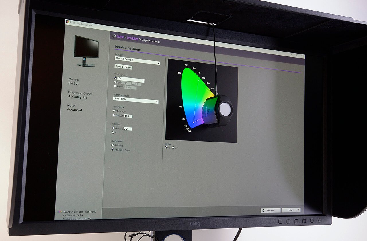
Photo: Michael B. Rehders – I calibrated the BenQ SW320 with the sensor from Calibrite. The software guides the user step by step through the calibration process.
Good Color Management Displays offer the possibility of a so-called hardware calibration. This does not "tune" the player (e.g. the PC) but the monitor itself. The calibration is then stored in a free memory in the Color Management Display and named as desired. In this way, several feeders can be adjusted in such a way that the correct colors are displayed on the screen.
I named two memory banks as follows to make it easier to match them up:
– Mac – Lenovo notebook
This calibration itself is carried out in no time at all. An optional measuring sensor is placed on the screen; the appropriate calibration program is started; then the step-by-step instructions must be followed and the automatic calibration starts. It takes a few minutes that I can use to get a cup of coffee and read the daily newspaper in the small café around the corner. When I come back, the calibration is complete and I can start image processing.
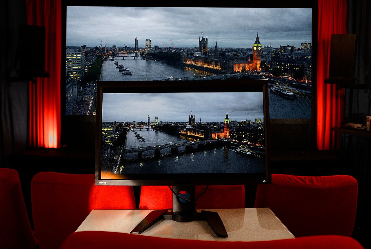
Photo: Michael B. Rehders – Likewise, video post-production requires a standardized color representation on the display. If the prescribed standard is adhered to in this respect, the artwork on the Color Management Display (here a BenQ PV270 with DCI-P3 color space) looks exactly like the image projected onto the screen.
Everyone involved in the workflow of an image production should adhere to the usual color standards so that the desired image result is achieved at the very end. With good Color Management Displays, it is basically guaranteed that the entire work process can run smoothly and optimally. That's why I use BenQ monitors. With them it is possible to evaluate the colors of works of art with professional standards.
Text, measurements and photos: Michael B. Rehders
For more information on BenQ Color Management Displays, click here:
This article has been published in specialist article, journalism and featured with BenQ, BenQ PV270, BenQSW2700PT, BenQSW320, screen, color management display, color management displays, display, colorfast, color space, monitor by Michael B. Rehders. Permalink
{{productsCount}}Result
{{item}}
{{item.productWordingTag}}
{{currency}}{{item.finalPrice| numberThousandsCommas | numberDecimalPoint}} Save {{currency}}{{item.saveAmount | numberThousandsCommas | numberDecimalPoint}} Save {{item.savePercent | numberThousandsCommas | numberDecimalPoint}}%
new device price {{currency}}{{item.regularPrice| numberThousandsCommas | numberDecimalPoint}}
{{item}}
{{itemTag.title}}
Max 4 products to compare reached.