{{item.name}}
Price: {{currency}}{{item.price| numberThousandsCommas | numberDecimalPoint}}
Qty: {{item.amount}}
Job References

Before we take a close look at the SW2700PT, I should explain who I am and what I do. My name is Mark Wood, I’ve worked exclusively in creative arts for almost a quarter of a century. My specialism is print, having first worked as a graphic designer before moving to photography; a shift made at the beginning of mainstream digital photography at the turn of the century. Throughout my career I’ve recognised the need to get colour and tone right. In graphic design errors in print runs can cost £1000s, Euros or Dollars to remedy, and I never want to be the one to have to pay that bill! Depending on the kind of photography you do colour mistakes can be as costly; wedding albums being one example that springs to mind.
I’ve worked as a press photographer, and as a commercial photographer shot interiors and products where accuracy of colour and tone is essential.
Teaching has always been an important part of my practice; lecturing in colleges and universities, in addition to running training courses for both professional and amateur photographers. You can find out more about me at www.markwoodphotography.com, but now let’s get to the review.
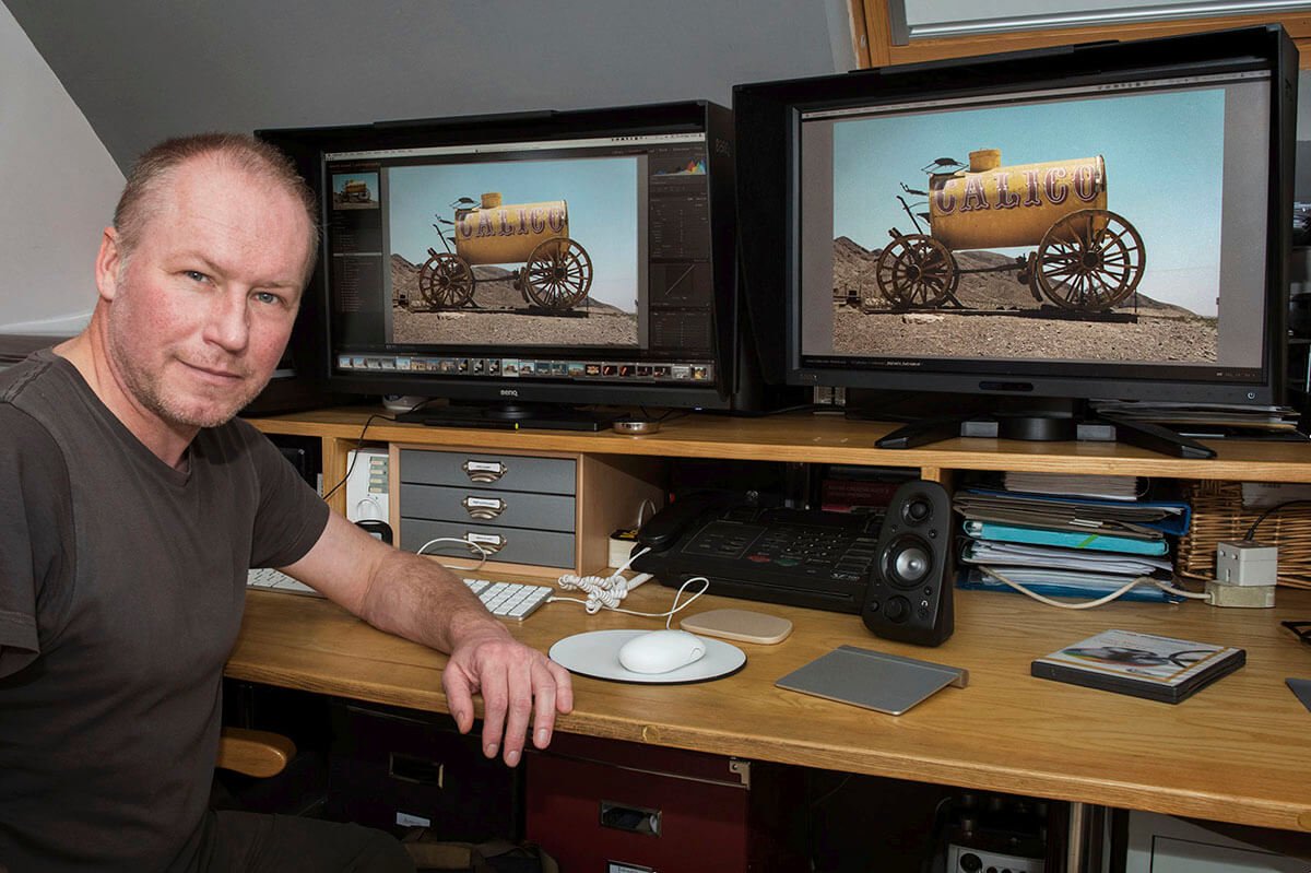
Context is important. The BenQ SW2700PT is a great display, at a very good price, but it retails for less than BenQ’s other monitor aimed at photographers serious about colour management, the BenQ PG2401PT. I’m lucky enough to have both monitors hooked up to my computer, making it easy for me to share my thoughts on both.
As photographers we would rather spend our money on cameras and lenses. My experience from teaching colour management workshops is that buying a colour capable monitor is fairly low down on a photographer’s shopping list, even though it’s the one essential item too many of us neglect in our photography workflow.
Let’s do some jargon busting. The technical specifications of the BenQ SW2700PT read as follows: 1). 27 inches, 16:9, 2560x 1440, IPS technology 2). 99% Adobe RGB coverage 3). Colour accuracy through 10-bit processing IPS panel, 14-bit 3D LUT, and excellent average ΔE ≤ 2 for Adobe & sRGB color spaces 4). Proprietary Palette Master Element Calibration Software 5). Black & White mode 6). Individually factory-tested colour calibration report included 7). Input terminals include DVI-DL, HDMI, DisplayPort, USB 3.0 together with a convenient SD card reader 8). OSD Controller 9). Shading Hood (Standard)
1. The display area of the monitor measure 27 inches across the diagonal. The aspect ratio is 16:9, the wide screen format; which I like when using Lightroom as it allows the panels on the left and right to be visible without comprising the way my photographs are displayed. The 2560x 1440 pixels over the 27 inch display make for tight, sharp reproduction of images. IPS stands for in-plane switching, it is a widely used display technology, more on that in point 3.
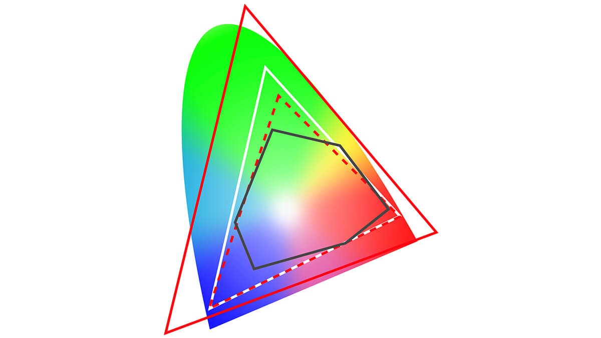
2. To explain Adobe RGB take a look at Figure 03, a chromaticity chart. The coloured arch represents all the colours the standard eye can see. The red dotted triangle represents sRGB, or small space red, green, and blue. It is a colour space equivalent to most mini-lab printing devices. Which might beg the question, why the need for the larger Adobe RGB space marked in white? Adobe RGB encompasses all the standard reprographic print colours; sRGB does not. The black shape represents a generic cyan, magenta, yellow, and black (CMYK) printing space, and it's for printing that Adobe RGB coverage is required. The large red triangle represents ProPhoto. Figure 03 suggests that sRGB and Adobe RGB cover the range of colour and tone required for CMYK, but viewing these colour spaces in 3D will demonstrate otherwise.
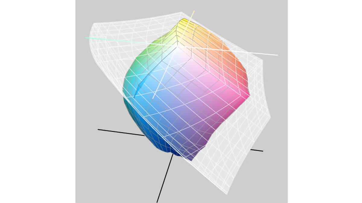
In 3D the curious shapes of the various profiles for paper and printer combinations illustrate the need for the extended gamut of Adobe RGB, as monitors capable of displaying this colour space gives photographers the best chance to view the print colours of inkjet printers and the like.Viewing reliable colours is essential for all serious photographers. Note that the print space extend beyond Adobe RGB in the blues.
3. Colour accuracy is achieved by making the display emulate 10-bit processing.The SW2700PT IPS panel has been enhanced with frame-rate control electronics. This gives 10-bit-emulation, ensuring the monitor can render smooth tonal gradations.True 10-bit displays are available but not at this price point, and tend to be used in medical imaging.
The 14-bit 3D LUT refers to how the monitor indexes input and output values. As with10-bit processing, the higher the bit count the greater the amount of values used. 8-bit is 28, or 256 values the same amount of tones per channel (R, G, and B) in a JPEG image. 10-bit is 210, or 1024 values. When comparing monitor specifications this information may help. At a complete tangent 14-bit is also the tone depth of raw images in most DSLRs. That’s 16,384 tones per channel. To conclude the greater the tonal depth of your display the better the rendition of tonal gradients.
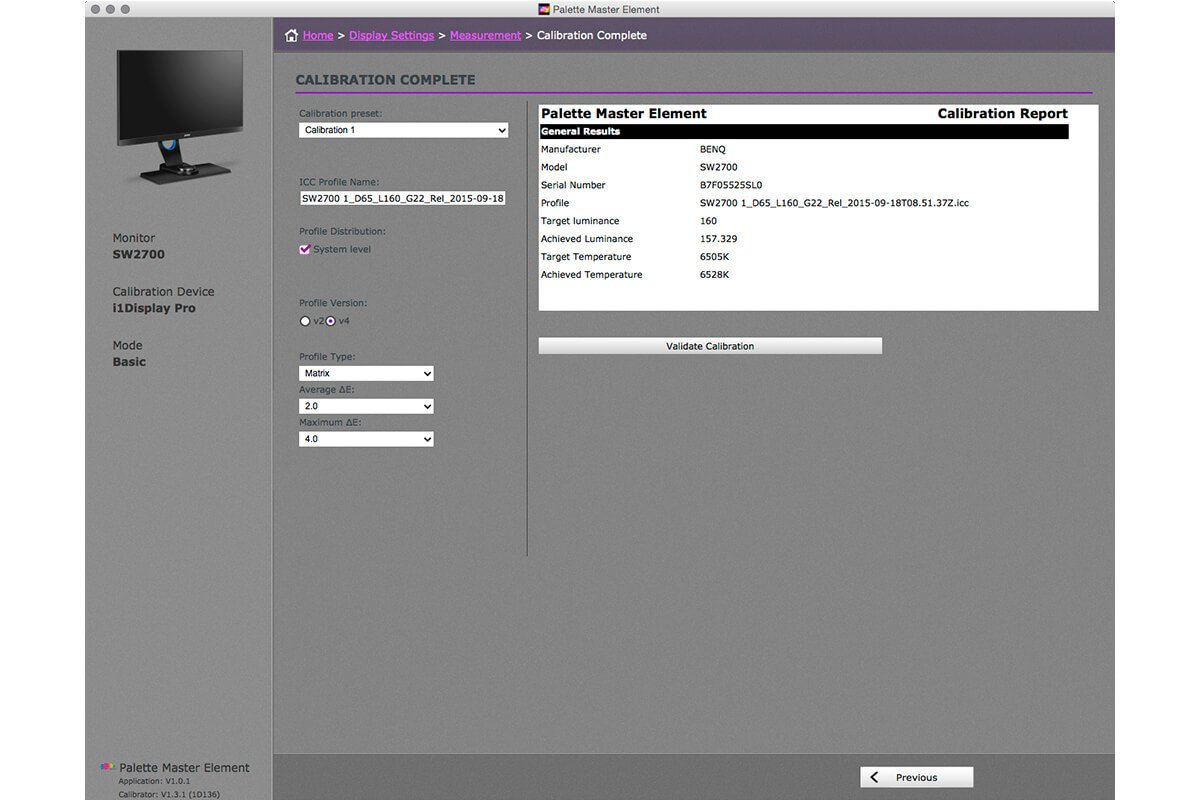
The last element is the delta E value, which refers to colour difference. When comparing monitor specification know that the lower the value the better the display is at translating colours accurately. For me having reliable colour rendition is essential.
4. The proprietary Palette Master Element Calibration Software is easy to use and essential when setting up your SW2700PT to display colour reliably. It is very important to note that the setting up and regular re-calibration and profiling of the SW2700PT requires one of the following calibrators, i1Pro, i1Pro2, i1DisplayPro, i1Display2, Spyder4, or Spyder5.
I’ll run through the set up process using the Palette Master Element later.
5. BenQ has put its Black & White mode front and centre. The SW2700PT ships with a USB On-screen Display (OSD) controller. The controller has three preset buttons set up to display Adobe RGB, sRGB, and Black & White. The controls can be customised, or you could run with the factory presets to quickly switch settings without going through complicated menu options.
The factory preset for Black & White is intended to allow users to preview colour photos in black-and-white before adding effects. This function is interesting, I create lots of monochrome images, but monochrome for me involves a colour tone, whether that’s sepia or a cool tone. Also, I often push channel mixing in Photoshop to the limits, so I need to see my monochrome preview in Photoshop or Lightroom.
The sRGB preset is of more interest to me. Swapping from Adobe RGB to sRGB using the OSD controller gives instant soft-proofing, the emulation of what the vast majority of internet users will see on their devices when viewing images.
6. Individual factory-testing of the monitors colour calibration is a vital part of quality control. I’ve lots of experience of teaching in classrooms where the monitors were bought with price winning over quality. The variance in quality has been astounding, and no amount of calibration would help align the tone and colour of the displays. All BenQ SW2700PT’s include a colour calibration report.
7. The SW2700PT has plenty of input and connection options built in the monitor, and ships with a DVI-DL, DP to mini DP, and USB cable. The USB cable is used for upstreaming; to connect the display to your computer when calibrating.
I hope the jargon busting section will help you decode the technical specifications. Let me draw a few conclusions now.
The BenQ SW2700PT is a good display. On paper it meets industry requirements for colour managed workflows. As a numbers game the SW2700PT looks like a winner, and make no mistake it is a really great display. BenQ has done a great job producing a monitor at a pleasing price, for better soft-proofing there are other displays on the market, but they cost a lot more.
This doesn’t mean the SW2700PT is deficient. For many photographers colour management workflows are affected by their studio environment, perhaps subliminally. Getting colour right means having the appropriate hardware set-up in the correct environment. Not knowing this will negate the effort to soft-proof. Also long hours of image processing changes our colour perception. For photographers printing in- house, and for those with a proper working relationship with a professional photo-lab, the limitations of the SW2700PT should not be an issue. Therefore I’m happy to recommend the BenQ SW2700T as a photographer’s monitor.
As the very mention of colour management can leave some people cold, we are going to take a look at the Palette Master Element software being used to set-up a SW2700PT. Before moving to that, here’s a few notes on assembling the display.
The SW2700PT comes securely packed in the standard polystyrene and cardboard packaging. The assembly instructions are simple and clear, though please note I’ve no fear of flat-pack furniture. I was immediately struck by the attractive design of the monitor. It looks great from all angles. Once assembled adjusting the height and tilt feels simple and secure; the height adjustment range is considerable.
Fitting the shading hood was the most challenging part of the assembly. I found that fitting the side panels first, then building the three part top panel before attaching it worked best for me. I welcome the inclusion of the shading hood in the box. With other manufacturers shading hoods can be expensive optional extras, but for colour management they are crucial, as they eliminate unwanted reflections and light. Let me explain: If you’ve used a tablet device, or a display with a high gloss surface you’ll have noticed reflections from windows disrupting your view of the screen, especially when dark images are being displayed. The SW2700PT has a matt surface to cut down these unwanted reflections, but more subtle reflections may still occur, fitting the shading hood will cut out all but the most direct light. This improves your ability to assess tone and colour.
Now for the Palette Master Elements software, which is available online. I favour downloading applications directly from manufactures’ websites to ensure I’m loading the latest version. BenQ specify the application requires Windows 7, 8, or 10 on a PC, or OS X 10.6.8 through to 10.11 on a Mac. Once installed here’s a run through the application, first in Basic mode, then in Advanced.
1.Switch off your screen saver and operating system’s energy saving functions. If either start whilst calibrating, the process will be invalid.
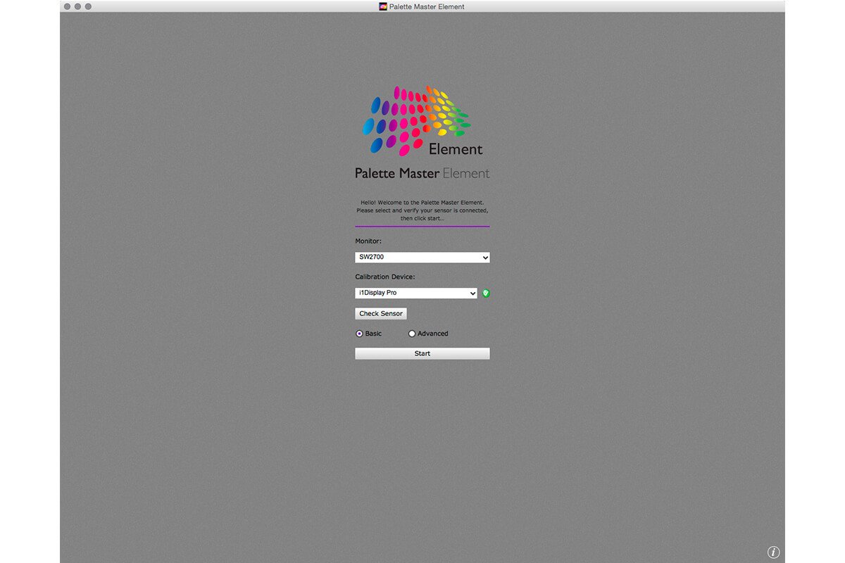
2.The splash screen for the application appears shortly after launching the Palette Master Element software. It confirms that the monitor and calibrator are connected; if an error message appears check your USB connections. With the Basic button selected the Start button was clicked.
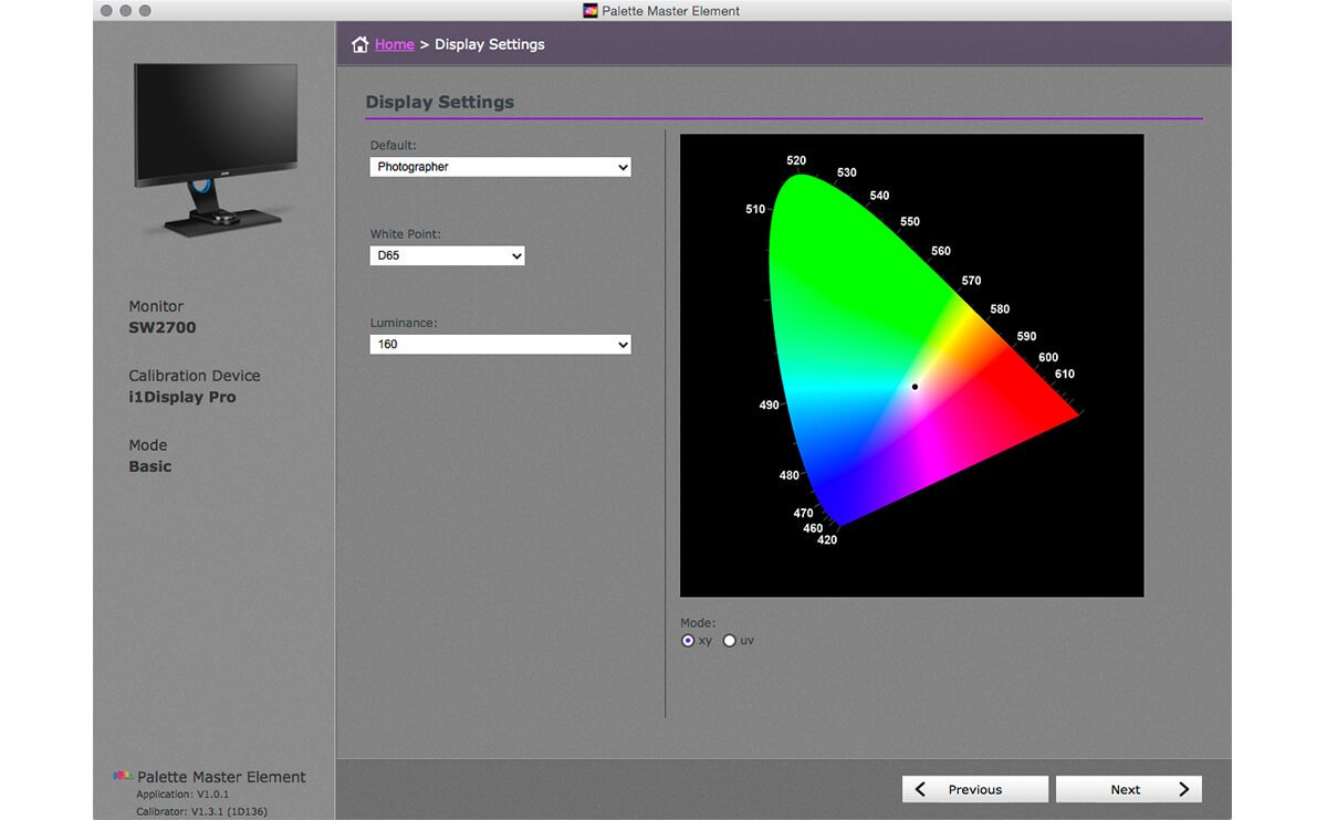
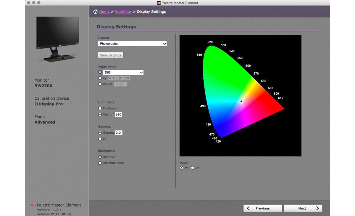
3. The Display Settings window is used to select the White Point and Luminance that best suits your type of work, the options are Photographer, Web Design, and Graphics. Choosing Photographer sets the White Point to D65 and the Luminance to 160 cd/m2. These are appropriate settings, though you might find some colour management texts that suggest 120 cd/m2. The Palette Master Elements application lets you choose this setting if you wish. I currently use 160 cd/m2.
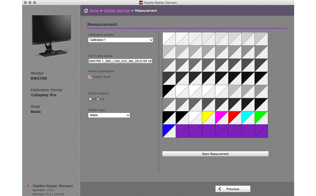
4. The Measurement window has options for two calibration settings, these can be accessed later and even set as presets on the OSD. The profile name created by the application is rather convoluted, but descriptive. It’s easy to key in your own name choice here.
I’m using a Mac and I like to have the profile created by Palette Master Elements available to all users on my computer, therefore I select the Profile Distribution to be on the System Level, I also select the v4 profile type as I have no need to create a backwards compatible profile. The Profile Type defaults to Matrix, though setting this to 16 bits LUT should create better calibration. Clicking Start Measurement moves you to the next screen.
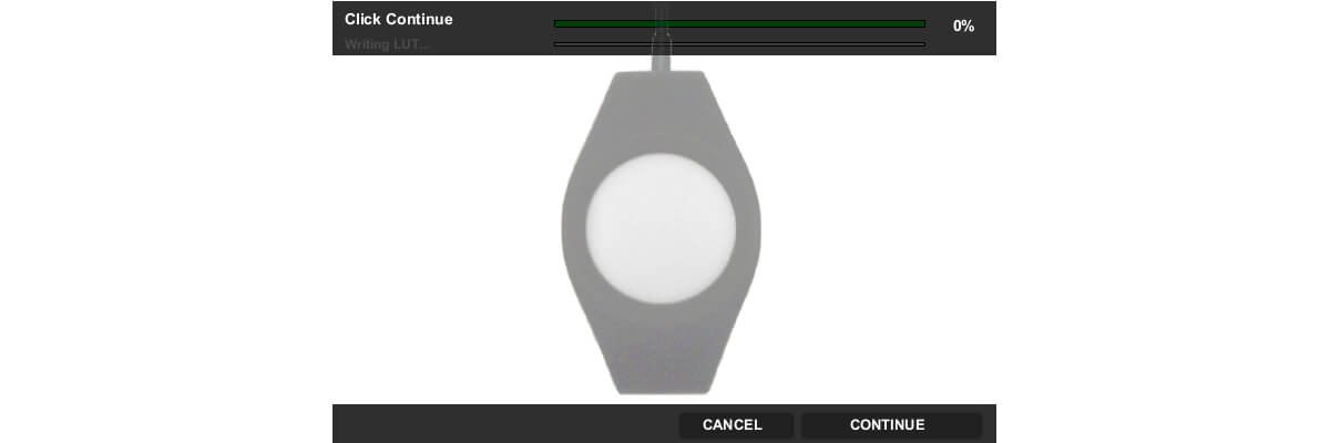
5. If you are using an X-rite i1 Display Pro /Calibrite ColorChecker Display Pro, a helpful illustration appears to remind you how to configure the calibrator.
6.The next step is to position the calibrator on your screen, be sure to have the display tilted back. Calibrators will have some form of counter weight to help the calibrator to sit securely and evenly on the surface of the monitor.
7. The final screen is a simple calibration report. Closing this window quits the Palette Master Elements application.
Now let’s take a look at the Advanced Mode. It’s not complex, but does offer more options that might only make sense to someone with colour management experience. I’ll explain which options to choose.
1.To choose the Advanced mode click that button on the Palette Master Elements splash screen. Then click Start.
2.The next screen is workflow. Click Profiling, then click Next.
3. The Display Settings are headed with a drop-down menu, as with the Basic mode, these are for Photographer, Web Design, Graphics. Choosing Photographer will set the most appropriate options. Leaving these on the defaults works well. Click Next.
4. The Measurement window, should be changed from the default. The calibration preset can be left on Calibration 1, this or Calibration 2 can be selected after calibration using the OSD. Like the Basic setting the default profile name can be changed to something more recognisable, if you wish.
Having the profile available to all users is a good idea, so should be selected. However, if you are setting up a display in a shared studio environment you will need system administration privileges to distribute the profile at system level. If that last sentence made little or no sense, please ask for help from your IT support when setting things up.
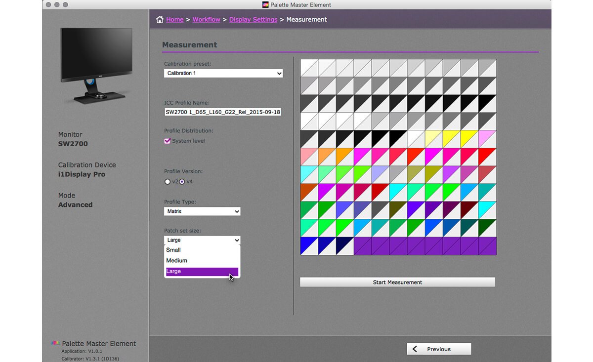
Changing the Profile Type to 16bit LUT and Patch set size to Large should create a more reliable calibration and profile
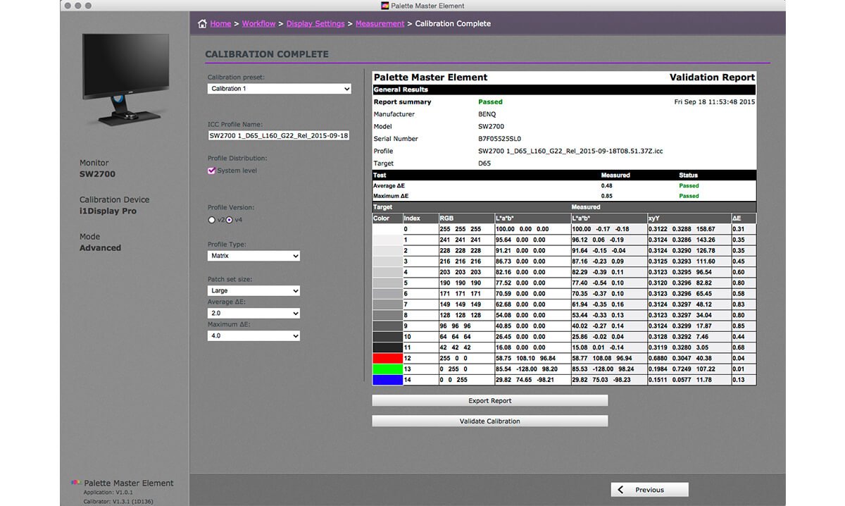
5. Clicking Start Measurement will begin the calibration process. When complete a Validation Report appears, this is more detailed than the Basic report, and can be exported. Much of the report would only make sense to someone steep in colour management practice.
To quit Palette Master Elements either close the window or Choose > File > Quit.
In Conclusion: BenQ has done a great job with the SW2700PT, which can be calibrated to display colour reliably; do note the types of calibrator listed by BenQ. It’s a monitor that should suit a photographer with a limited budget who cares about colour. Having a colour capable monitor is essential for all serious photographers. Take a look at the BenQ SW2700PT I’m sure you will like it as much as I do.
Get One Free Year Pantone Connect
{{productsCount}}Result
{{item}}
{{item.productWordingTag}}
{{currency}}{{item.finalPrice| numberThousandsCommas | numberDecimalPoint}} Save {{currency}}{{item.saveAmount | numberThousandsCommas | numberDecimalPoint}} Save {{item.savePercent | numberThousandsCommas | numberDecimalPoint}}%
new device price {{currency}}{{item.regularPrice| numberThousandsCommas | numberDecimalPoint}}
{{item}}
{{itemTag.title}}
Max 4 products to compare reached.