{{item.name}}
Price: {{currency}}{{item.price| numberThousandsCommas | numberDecimalPoint}}
Qty: {{item.amount}}
Job References
Today, a product’s worth doesn’t depend exclusively on having the latest technology and features. Overall design and user experience also play an essential part. When choosing which phone you should buy next, you probably have other factors in mind besides camera resolution or screen size. These additional aspects related to the usage of a device are called User Experience (UX) and make for a big part of the product. Companies devote tons of time and resources to developing the best UX to improve usability and the value of their products.
When it comes to projectors, ergonomics are a critical aspect of the UX. If you remember the last time you used a projector, whether it was an office or a home entertainment projector, you probably agree that projector keypad buttons are confusing. Choosing the right input source, changing the keystone, or simply adjusting the volume can quickly become a frustrating task due to awkward function keys and bad design.
BenQ devotes a substantial amount of resources to create products that include the latest technologies and are also easy to use. We believe that the subtler benefits of an ergonomic design are worth the extra steps and that our users deeply value them. That is why we have revamped the design of our projector’s function keys to avoid accidental or incorrect presses and confusing menus.
The new keypad buttons on our projectors meet all the essential aspects of good UX design by providing a beautiful layout that is pleasurable and easy to use. Our team kept three crucial elements in mind when working on the new keypad design: aesthetics, intuitiveness, and usability.
First, we made sure that our overall design is clean and straightforward. When you see the projector installed on the ceiling or sitting on top of a table, the keypad buttons shouldn’t be the most notable feature. We place our keypad in the right spot and keep appropriate proportions to improve ergonomics.
Then, we took a good look at what icons we were using and asked ourselves if their meaning is always evident. The function of each key should be stated clearly using text and icons to avoid any need for guessing and mistakes. Even the location of a specific key can tell the user a lot about its function.
Lastly, we evaluated all these decisions in terms of usability. Looking good and having an apparent function only provides a real ergonomic benefit if it improves usability for the end user. During testing, many design decisions get scrapped, while unforeseen needs become apparent.
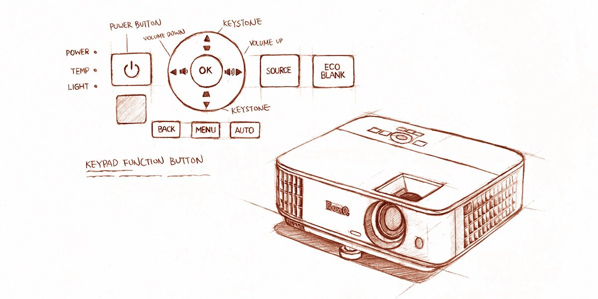
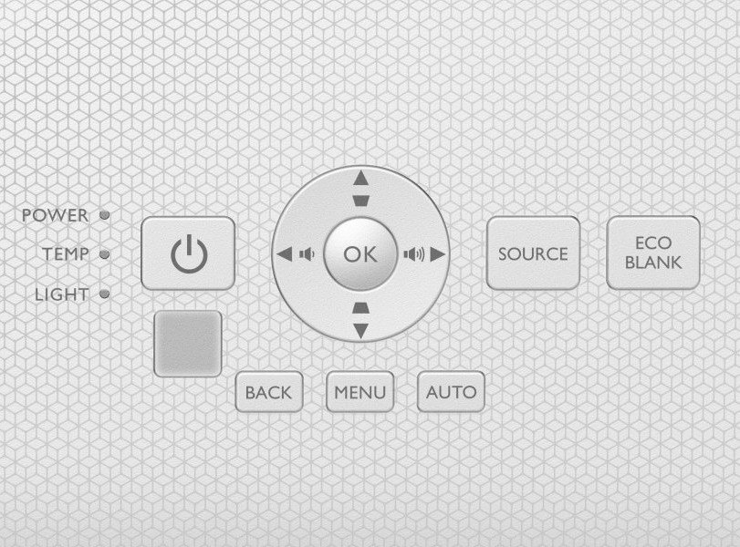
For example, we changed the 3 x 3 grid with a power button design to a five-key directional design (up, down, left, right, and the OK button). Using a five-key directional design is more intuitive and handy for users. It allows for easy adjustments of keystone and volume by using the arrow keys and gives the most relevant buttons a bigger size in a central location. Based on user behavior, creating a hierarchy by using different-sized buttons can improve ergonomics. Using large buttons surrounded by smaller ones can indicate relative importance very quickly as is the case for the OK and power keys.
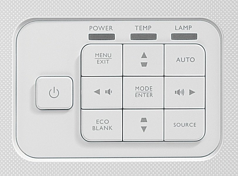
Old design with a 3x3 keypad layout.
New design with a 5-key directional keypad.
Perhaps the best example of good ergonomic design is our new approach to the large fingers/small buttons problem of our projector keypads. Where many other projector manufacturers prioritize aesthetics, we are putting the importance on usability. Most projectors have tiny buttons cramped in an equally small space. That leads to erroneous presses of more than two buttons at a time and lots of frustration. We have increased the spacing between buttons, made them more prominent, and changed the layout of the keypad design while keeping its aesthetic appeal, effectively solving this problem.
User behavior and feedback drive BenQ product design. Even though keypad buttons are only a small part of the whole projector, we take their design very seriously. We know that when users operate the projector, whether they want to watch a movie or give a presentation, the ergonomics of the keypad have a significant impact on user experience. That is why we have designed the new keypad to perform the functions needed by users while keeping excellent aesthetics, intuitiveness, and usability in mind.
{{item.productWordingTag}}
{{currency}}{{item.finalPrice| numberThousandsCommas | numberDecimalPoint}} Save {{currency}}{{item.saveAmount | numberThousandsCommas | numberDecimalPoint}} Save {{item.savePercent | numberThousandsCommas | numberDecimalPoint}}%
new device price{{currency}}{{item.regularPrice| numberThousandsCommas | numberDecimalPoint}}