{{item.name}}
Price: {{currency}}{{item.price| numberThousandsCommas | numberDecimalPoint}}
Qty: {{item.amount}}
By Series
Immersive Gaming Series Home Cinema Series Projectors TV Projector Series Portable Series Golf Simulator ProjectorsBy Scenario
Home Entertainment Projectors Best 4K Projectors Best Projector for World Football Video Streaming GV Series Portable Ceiling ProjectorsBy Trending Word
4K UHD (3840×2160) Short Throw 2D, Vertical/Horizontal Keystone LED Laser With Android TV With Low Input LagExplore Commercial Projector
Professional Installation Exhibition & Simulation Small Business & Corporation Education Golf SimulatorRemote Work & Learning
Projector
Monitor
Lighting
Interactive Display | Signage
Remote Work & Learning

This copy is linked from Martin Bailey’s Blog Posting: BenQ SW2700PT Photographer’s Wide Gamut Display Review (Podcast 519)
(https://www.martinbaileyphotography.com/2016/04/18/benq-sw2700pt-photographers-wide-gamut-display-review-podcast-519/)
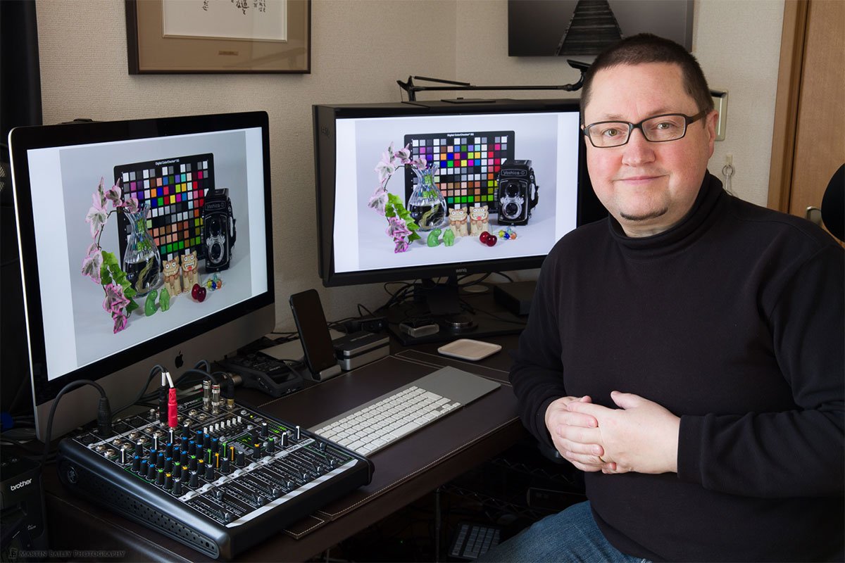
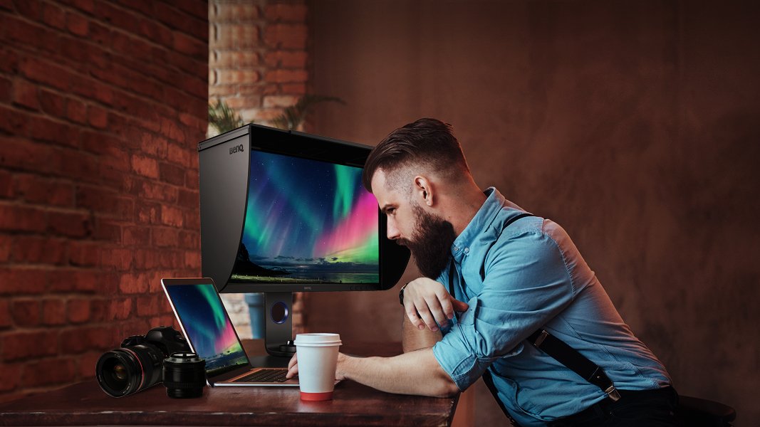
I’ve recently had the pleasure of trying out a new display aimed at the photography market by BenQ, a company that I had not considered a player in the quality display market, until now. I’ve been using their 27 inch SW2700PT display for the last four months now, and I’ve been highly impressed, so today I’m going to give you a run down of this new offering.
My findings have been mostly very positive with just a few quirks that I can live with, especially at its price. From the design and build quality, to included accessories and ports, not to mention having 99% of the Adobe RGB color gamut covered, I’d say that without doubt, BenQ are now well and truly in the quality display market, with a product totally capable of meeting the quality conscientious photographer’s needs.
Let’s first take a look at the impressive specs for this display. I actually checked out the specs before I saw the price, and I was honestly thinking that the SW2700PT was going to be retailing at three times the price that you can buy it for on B&H, which, at the time of writing (April 2016) is just $629.99. Honestly, these are the sort of specs and accessories that you’d usually expect to see in a display two to three, sometimes up to four times more expensive, depending on the manufacturer.
I should mention here of course, that some of the much more expensive alternative displays do include a built-in colorimeter to perform hardware calibration. With this offering from BenQ you have to use your own colorimeter, but if you already have one, that’s perhaps not a big deal. In fact, the reason I bought a display that did not have hardware calibration in the past, was because I didn’t want to pay the extra for a built-in colorimeter as I already owned one.
Firstly, this is an IPS display, which means it uses In-Plane Switching Technology, so it has a very wide viewing angle of 178° from any angle. IPS is becoming more common, but still many budget displays are not IPS, despite being more expensive than the SW2700PT. The resolution is 2560 x 1440 pixels creating an actual resolution of 109 pixels per inch, which is the same as my non-Retina 27 inch iMac screen.
It has DVI-DL, HDMI 1.4 and Display Port inputs, so you have a nice range of optional ways to connect this display to your computer. It also has a headphones socket, although DVI will not transmit audio to the display, so if this is important to you, you’ll need to use the HDMI or Display Port connectors. If you want to use the display at its maximum capability, I recommend using the Display Port connectivity.
It has a 1000:1 Contrast Ratio with 350 cd/m² (candela per square meter) Brightness, which is also impressive. As photographers, we generally want to turn the brightness down a little, to match our images and printers in a color managed digital workflow, but many other displays at much higher prices aren’t this bright. The 5 ms (GtG) Response Time is also 1 millisecond faster than most competitors.
The SW2700PT supports 1.07 Billion colors covering 99% of the Adobe RGB Color Gamut. Again, this is what you can usually expect to see in the specs of displays two to four times more expensive than this one, for the same 27 inch widescreen models. These specs really are very impressive, regardless of the price.
Another pleasant surprise was that the SW2700PT display comes with a shading hood as standard. This is often an option for other high end displays, costing sometimes up to $200 just for the hood. I was even more impressed to find that it has a velvet like coating on the inside of the hood, to stop light from reflecting off the hood onto your display, as simple shiny black plastic can.
There is also a square opening with a sliding cover in the top of the hood to feed your calibration device through when calibrating the display, so that you can do this without taking the hood off. The sliding cover of course means that you can close it when you aren’t calibrating the display, to keep stray light out. The hood itself is a nice addition, and BenQ’s attention to these extra details really shows that they are serious about the photography and imaging markets.
Calibrating the BenQ SW2700PT Display
When I bought my iMac, one of the things I had been waiting for, was the reduced reflectivity in the display, and although this was nice, I have found that the display does still reflect a lot of light, especially on sunny days when I have a lot of bright sunlight bouncing around my studio.
The BenQ SW2700PT display has a beautiful matte finish to it, and I think that is incredibly important for a photographer, especially if you work in an environment with reflective or brightly colored objects, or any bright light sources around you. It’s also much better to use a matte display if you print on matte paper, simply because get a better idea of what your prints will look like than when you view them on a glossy screen.
Another nice addition is the pair of USB 3.0 ports on the left side of the display, accompanied by an SD Card Reader slot. You have to plug the display in to a USB port on your computer to enable some of the functionality anyway, so extending that out to give the user a couple of extra ports is nice, and especially useful when calibrating the device, as you can just plug straight into the display. In fact, you have to do this to enable hardware calibration, as we’ll hear shortly.
I would actually love to see manufacturers include a Compact Flash port instead of or in addition to the SD Card slots that we often see, especially when you consider that CF cards are more popular in higher end DSLR cameras, but this is one area where all manufacturers still seem to be catering for the consumer end of the market unfortunately.
Perhaps one of the most important features of the SW2700PT display is the ability to perform hardware calibration. Although you can profile the display with the software that comes with your calibration device, if you use one of the five currently supported colorimeters, you can save your profile directly into the displays internal 3D LUT (Look Up Table) so that your images will look consistently accurate. Currently, you can use the X-Rite i1 Pro, i1 Pro 2, i1 Display Pro, i1 Display 2 and the Spyder 4 from Datacolor to perform hardware calibration. In my tests I have used the i1 Pro 2 from X-Rite.
I’ll walk you through a calibration process later, as this is an important feature, and there are some quirks that you will need to keep in mind too. Before we jump into that though, let’s move on from discussing the specs, and talk about what it really means to use a wide gamut display like the SW2700PT.
I know that some of you are going to be wondering what the big deal is with this display having 99% coverage of the Adobe RGB color space, so let’s explore this a little. What does this mean to us as photographers?
The main thing to keep in mind is that whenever we display our images, a conversion is taking place. As I showed in my post about the ProPhoto RGB color space, it’s best to edit your images in a wider color space than your images are captured in. I know that there are arguments for restricting your images to a smaller color space to avoid problems later in the workflow, but I personally don’t subscribe to this school of thought. Lightroom uses a large color space based on ProPhoto RGB by default, and it’s best to set up Photoshop to use ProPhoto RGB by default too.
Your camera is most likely creating images in a color space larger than Adobe RGB, so it’s best not to restrict your images by working in a smaller color space like Adobe RGB or the even smaller sRGB, which is only really used for displaying images on the web and other low quality imaging technologies. Also, I know you probably have an option to record your raw files in Adobe RGB or sRGB on your camera, but this is misleading. The images are actually using much wider color spaces. This setting is just to tell your camera how to tag your images, and doesn’t actually change the colors used in raw files.
Once we’ve edited our images, although we can keep our original files in raw format if you use a non-destructive editor like Lightroom, or even if you save a TIFF or Photoshop format file, you can save your original images using wide color spaces like ProPhoto RGB. But, when we come to export them, we often have to squeeze them into smaller color spaces like sRGB or Adobe RGB. When we do this, we convert the colors to the closest possible available color in the new color space. Because of this, quite often, if you are viewing your images on a display that doesn’t display many more colors than sRGB, you really aren’t going to see much difference.
If your photo contains mainly colors that are present in all color spaces, there really isn’t much of a compromise to be made during the conversion anyway, so quite often, you won’t see much difference, unless you are pushing your processing quite a bit, or photographing naturally very vibrant subjects, which may contain colors that are simply not in the smaller color spaces.
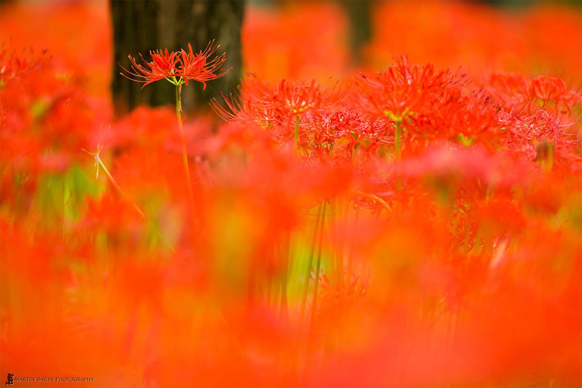
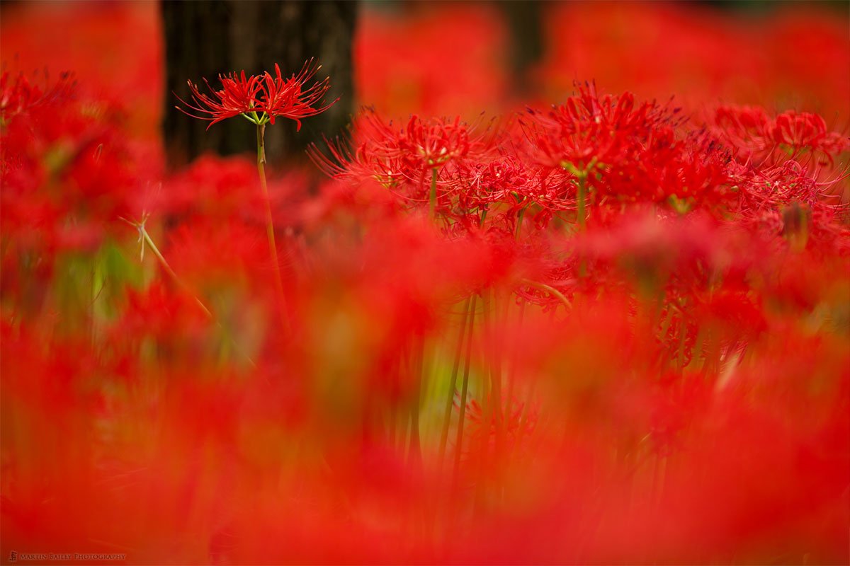
In these situations it can become more apparent that the conversion is causing issues. I looked through hundreds of my photos to find some that showed me the true benefits of using a wide gamut display, and I finally found a few that had very vibrant colors in, such as this photo of a field of Equinox Flowers (below).
Sea of Red – Original Processing
When I made this photograph back in 2008, Lightroom was still very new, in version 2, and the ability to use camera profiles to adjust the look of an image had just been added. Because I was a FujiChrome Velvia slide film shooter back in the film days, I like vivd colors, and I’d emulated that back in 2008 by pumping up the reds, bringing the image closer to what I felt I’d seen in the field, or at least that’s what I thought I was doing when viewing my changes on my old display.
Since doing that first process of this image, a lot has changed, and I’ve had multiple computers in the meantime, each with a slightly better screen, but I was always relatively happy with how this image looked, although as things changed, I realized that I was pushing the reds a little bit too far. Velvia was a punchy film, but not quite that punchy.
Anyway, as I scrolled through my images on the SW2700PT display, my Equinox Flower photo looked totally different to how I’ve seen it before. It actually looked duller, nowhere near as vivid as I had been used to seeing it, and that stopped me in my tracks, then it took some figuring out to understand just what was going on.
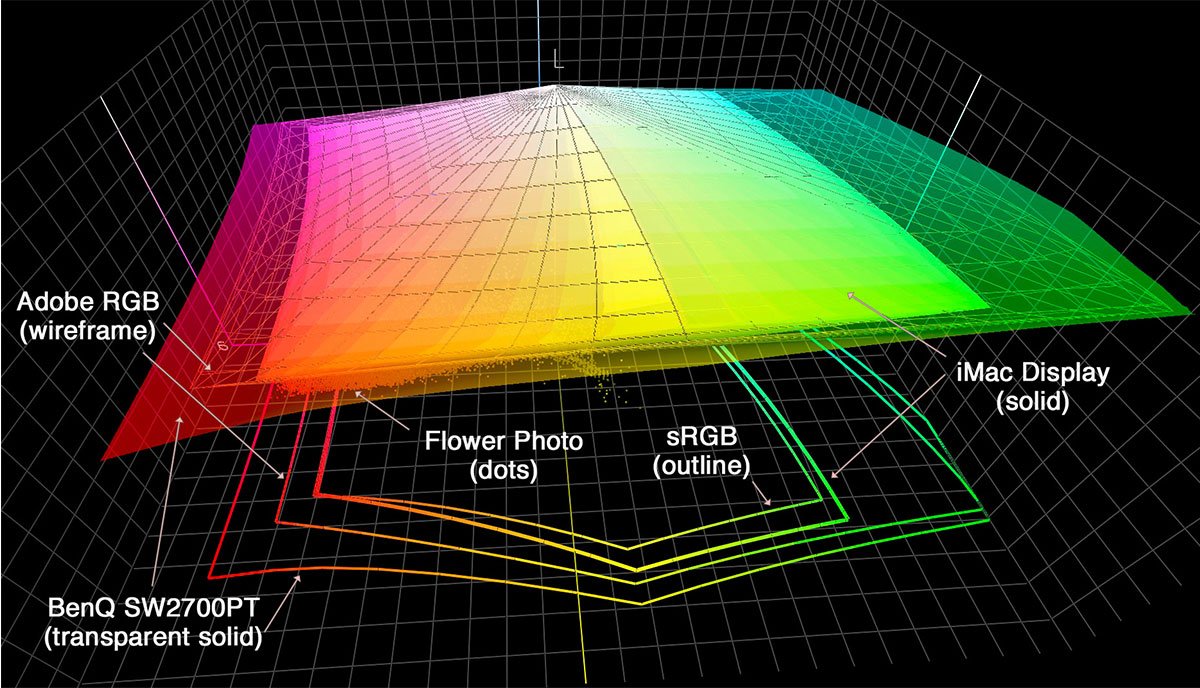
I took my Equinox flower into a piece of software called ColorThink Pro, which is an application that I use a lot to visualize color spaces both for education purposes and for my own research. I then loaded the Adobe RGB and sRGB color spaces, then the profile for my iMac, and at this point, I noticed that the colors in my photograph were extending out of the Adobe RGB color space and my iMac screen’s profile.
Then, I loaded the ICC profile that I made for the SW2700PT, and when viewed in Color Think Pro, it’s actually larger than the Adobe RGB color space, but apart from some lime greens, all of the colors in my vivid Equinox Flower shot fit inside the SW2700PT’s profile, as you can see in this image (below).
Profile Plots
So, I believe what’s happening here is that when I view my image on other devices, such as my iMac screen with it’s much smaller color gamut, only slightly larger than sRGB, I am simply not able to see the colors that my processing had created. I’d pushed the image beyond the boundaries of my display’s capabilities. I thought I could see the changes, but what I was looking at was a version that had been shoehorned into the smaller color gamut of my old computer display.
When I was able to view the colors much closer to those contained in my image on the SW2700PT, I was now for the first time in a position to rework the image, seeing all of the colors that it holds, and the result is still a very punchy image, but it’s much closer to vibrant and lush deep reds that I recall from the scene. Of course, my memory of the eight year old shoot is probably fading more than I realize, but this new version feels much closer than my original version from back in 2008.
Sea of Red – New Processing
This for me was a revelation. I’ve heard people talking about the benefits of using wide gamut displays, and didn’t quite understand what this meant, until now. Even as I looked through my images, it just was not apparent, until I came to an image that I’d blindly pushed too far on my lesser displays of the past. The SW2700PT has enabled me to finally move past that.
You might be thinking, well, I don’t push my images that far, so it doesn’t matter to me, but you know what? I didn’t think that I did either. Sure, I like to push the colors on some of my subjects, especially when the base image contains some very vivid colors, but it wasn’t until I revisited the processing of that old image that I realized the danger of processing an image outside of the visible range of colors that my display enables me to see.
There is a huge difference between blindly pushing colors past a limit that you can’t see, and taking images to the boundaries of what you can see, with the SW2700PT from BenQ.
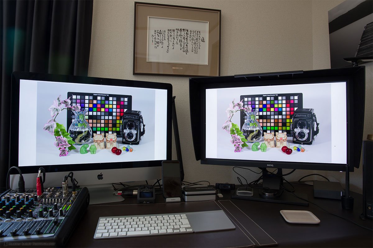
As a predominantly nature and wildlife photographer, the quality of my display is highly important to me, so I set up Lightroom on the SW2700PT display, with Lightroom’s second display window active on my iMac. I had all of the panels minimized so both screens were displaying my images as large as possible, making them exactly the same size on both screens.
I then sat down and looked through hundreds of my images to see if I could recognize some differences. I’ve already discussed the revelation as I looked at an image that I’d inadvertently pushed too far, but many of my images aren’t quite that punchy, so the benefits of the SW2700PT aren’t that apparent on first glance, but there are differences.
There are times when my images look slightly more defined and clearer on the BenQ display. It’s like what happens when you increase the Clarity slider in Lightroom, but it isn’t across the entire image. The gradations are beautiful and smooth, but areas where the image contains more structure seem to come to life.
There is a definite presence in my images when viewed on the SW2700PT that just isn’t there on my iMac display. The eyes in the animals in my wildlife photographs look more alive, and there is more depth, a distinct feeling of looking into a three dimensional scene when I look at my landscape photographs on the SW2700PT display.
Pensive Power
There is one other thing that you might want to bear in mind as you buy into a wide gamut display, and that is that if you view web sites in a browser, the colors might get messed up. Although most browsers now understand and utilize the color profiles embedded in images and graphics for display within the browser, at this point in time, I found that both Google Chrome and Firefox on the Mac caused the colors in images to become either under or over-saturated, depending on how they are being displayed within the browser.
Now, although I like some of the features of these browsers, I do quite often use Safari because of it’s tight integration with the Mac OS, and in this case that benefit shines through 100%. Safari seems to handle images perfectly in both displays, so I’m kind of back in the Safari camp at the moment, and have set it back as my default browser.
Of course, none of this affects Lightroom and Photoshop and that will also be the case for any other mainstream application for editing or viewing images. These applications are used to working with images in larger color spaces like Adobe RGB and Prophoto RGB, so your images will always look fine in these applications.
One main difference is that the Safari browser understands version 4 ICC profiles, and Chrome and Firefox do not at this point. Maybe if I were to have created version 2 profiles, this would not be an issue, or maybe Safari would be messed up as well. I haven’t tested this, because the International Color Consortium recommend using version 4 profiles when possible, because of a number of improvements that you can see here. These are good enough reasons for me to not use version 2, so I’m sticking with my Safari workaround until Chrome and Firefox catch up.
OK, so let’s walk through the calibration process, as this can be a little bit quirky, but for the quality of this display, at this price, I’m happy to put up with that. Firstly, to perform the hardware calibration you have to use BenQ’s proprietary software, Palette Master Element. The software feels a little bit rough around the edges, and I’ve reported a few issues to BenQ, and I’ll include some of these here as I’ve come up with some workarounds as well, which will hopefully help you if you pick up one of these displays.
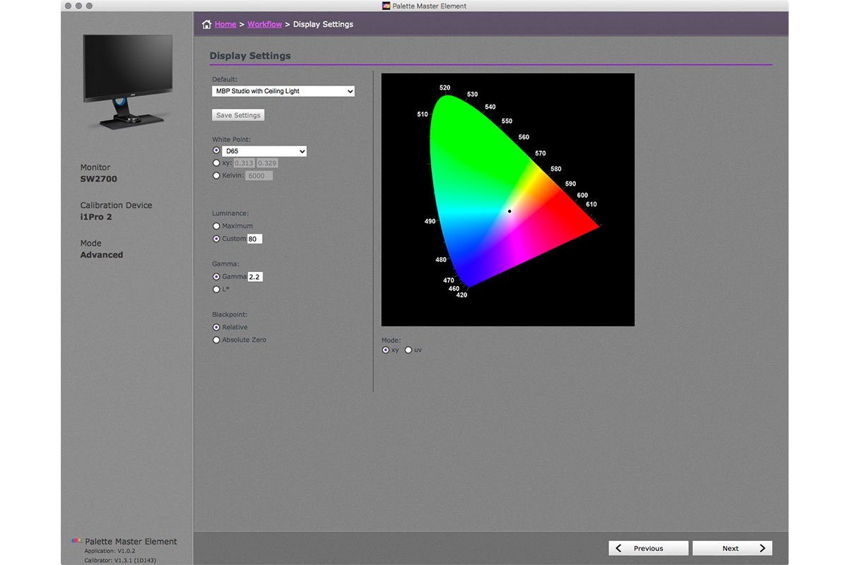
To start with, I think it’s probably best to select the Advanced Mode, because it gives you more options, that you’ll probably need as a color management conscientious photographer. On the Display Settings screen, I select D65 as the white point. This is a good base for photographers working in RGB. Probably the most important thing is that you need to decide what Luminance setting to use for your own working environment. It would be nice if the Palette Master Element software had the option to measure the ambient light levels in your workspace and offer a suggested Luminance value, but it doesn’t do that, so I take a measurement beforehand using X-Rite's i1Profiler software that comes with their colorimeters.
For an overcast day in my studio, I set the Luminance to 80 cd/m2 and for brighter days with sunlight in the studio, or for evenings when I have the room lights on, I use 120 cd/m2. I have performed two different Hardware Calibrations for my SW2700PT. For Calibration 1 I set the Luminance to 80 and for Calibration 2 I selected 120. This enables me to quickly switch between these two settings with the OSD Controller, which I’ll explain more about shortly.
Display Settings
For the Gamma settings, the standard now is 2.2, so if you have no reason to change this it’s best not to, and for a photographer it’s probably best to leave the Black Point set to Relative. If you make any changes to these settings, you might want to hit the Save Settings button and save them as a preset with a name that means something to you before you proceed. That way you can easily recall your settings when you calibrate again in the future. Once you have your settings selected, click the Next button.
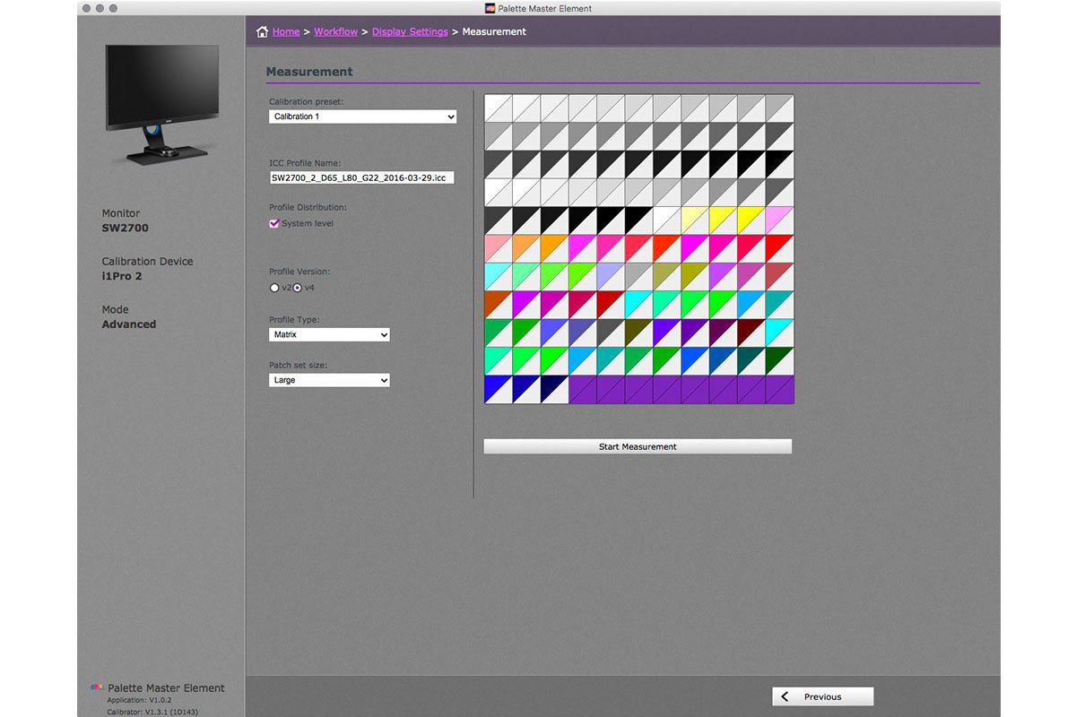
On the Measurement screen, select the Calibration preset, then modify the profile name if you want to, and I always check the System Level checkbox so that the profile gets written to my System profiles directory rather than the user directory. I only ever use a computer with one user, so this isn’t a big deal, but I just like to have this stuff saved at the system level.
Display Measurement
I always use v4 for the Profile version, although there are some issues that I mentioned earlier. Generally though, if you don’t mind using Safari as your web browser, I can’t think of another reason, on a Mac at least, why you wouldn’t use version 4. For the Profile Type option select Matrix to ensure that you use the 3D Matrix for the best possible profile. Also, on the calibration settings, select the Large Patch Set, as you want as much color information gathered to create the highest quality profile as possible.
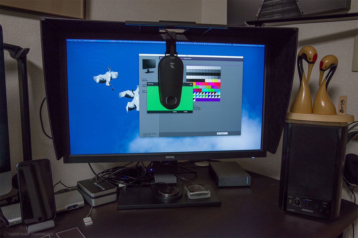
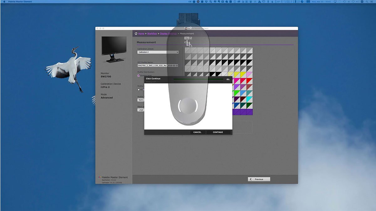
You are then instructed to place your colorimeter on it’s white calibration tile, and press the button on the device to calibrate it, but there is currently no indication that the calibration has taken place or if it was successful or not, which is one of the disconcerting things that I mentioned.
I am guessing here, but I think the graphic is straight from X-Rite’s i1 Profiler software, and the device is not even waiting for you to press the button at that point. I think the calibrating of the device only starts when you press Continue, after which there is a bit of a delay while calibration is performed, and then you are asked to attach the colorimeter to the screen and click Continue, as you can see here (below).
Then, as the colorimeter is reading the color patches that appear on the screen, there are periods of time when the software seems to hang, and the device itself is covering much of the status bar, which makes this process a little worrisome. Given time though, the process does progress in spurts, then complete successfully. This process could be smoother, or the software could give more reassurance to the user, but it does work.
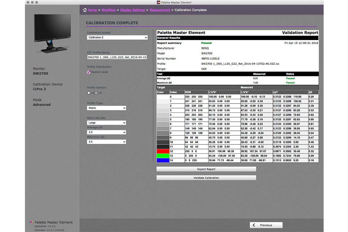
On the Calibration Complete screen there is a button to Validate Calibration. If you click this, you’ll have to recalibrate the colorimeter and place it back on the screen, and then wait a minute or so as it scans a few more color patches, but then you will see a report telling you how much delta you have between the color that the software is displaying and what the colorimeter is actually reading from the screen.
BenQ is claiming a Delta E≤2 (color difference) for this display, and in my tests I have found that I’m getting an average ΔE of 0.51 and a Maximum ΔE of 1.43, so they are indeed under two, which is very impressive.
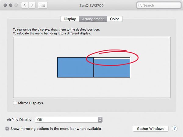
There is an issue that I have reported to BenQ that could cause you problems, so I thought I’d also mention that here. I’m not sure which other systems this could affect, but if you will use the SW2700PT display with an iMac like me, you need to ensure that you set the SW2700PT display to be the main display.
When I first ran hardware calibration I found that my display was not passing this final validation process, and the resulting ICC profiles were not consistent. I contacted BenQ and they could not reproduce the issue, so it had me stumped for a while. Then I realized that BenQ were profiling their display as Display 1, the main display, and I had my SW2700PT set up as Display 2, a second display. When I set it to be the main display, making my built-in iMac screen the second display, the ICC profile was fine and the Validation process completed successfully too.
I have let BenQ know and I’m hoping that this will be fixed in the Palette Master Element software, or a firmware update for the display, but at this point in time (April, 2016) you will need to ensure that you have your display set as Display 1, meaning that the main toolbar is on your SW2700PT, as you can see in this screenshot and not on the iMac display.
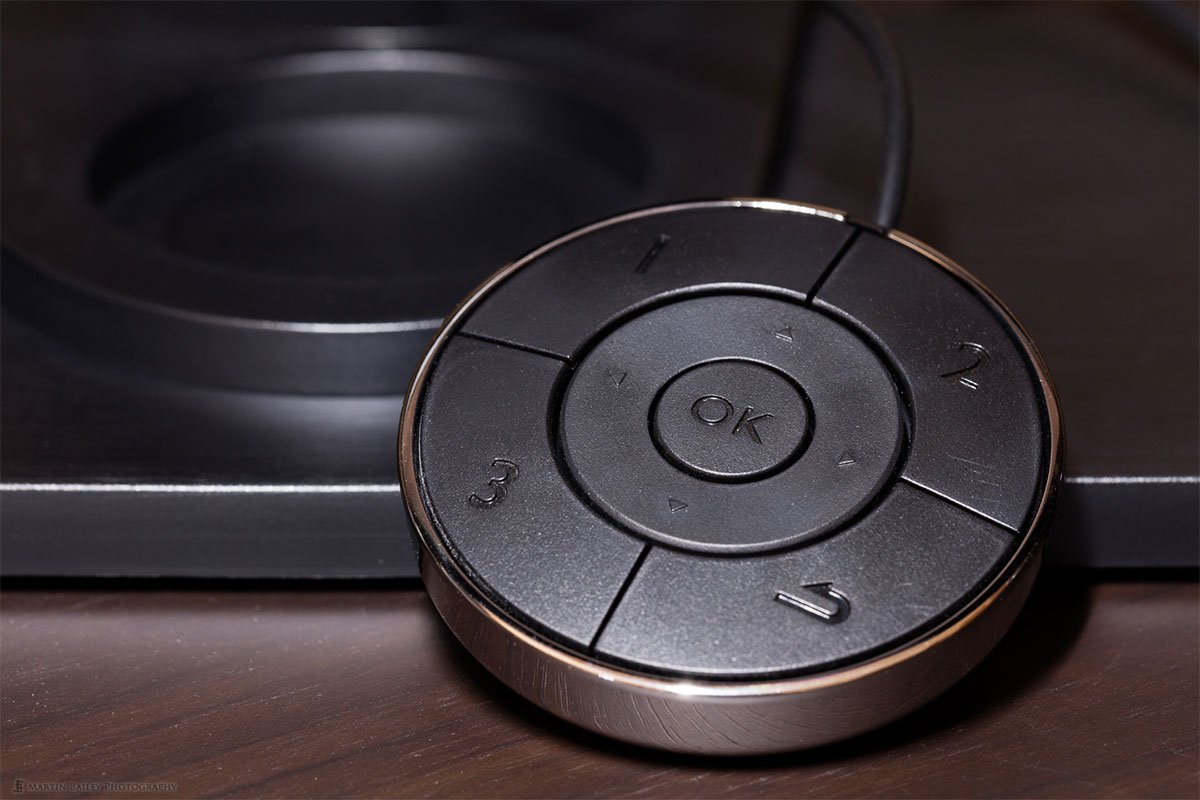
THE OSD (On-Screen Display) Controller is an amazingly useful accessory that comes with the SW2700PT display. This is basically a little circular controller that you plug into the display, which sits nicely in the dedicated base when not in use. When you want to control the display though, you can pull the controller closer to yourself, and use the 4 main buttons, 4 directional buttons and OK button to control the display.
This makes it really easy to change the settings of the display for various situations, such as switching between the built-in hardware calibration settings or changing the brightness etc. Although it’s important to note that you can’t change the brightness when using the hardware calibration stored in the Calibration 1 and Calibration 2 settings. I’ll share how I work around this in a moment.
It’s also possible to easily to change the height of the display, and to rotate it 90 degrees into a vertical orientation to view portrait aspect images full screen when necessary. There are good ranges of tilt and swivel as well, so it’s easy to reposition the display into pretty much any position.
The only other shortcoming of the SW2700PT display in my opinion, is that is does not have an Automatic Brightness feature. If you work in an environment where the ambient light is constant, this is not an issue, but if you have sunlight in your workspace, you’ll probably find that like me, your ambient light can change quite a lot depending on the weather.
The actual colors in an ICC profile that you create for your display don’t really change as you increase or decrease the brightness of the display, so in my opinion, it is fine to adjust the display brightness to match your ambient light conditions. In fact, with my iMac screen, I set the brightness during the calibration process, based on the ambient brightness of my studio, but then I leave Automatic Brightness turned on.
This causes the display to change its brightness according to my ambient light levels, but it maintains the relationship to the baseline brightness that I set during the calibration process, and that makes the brightness of the display appear constant to me, as my eyes adjust to the ambient lighting and iMac display together.
As I mentioned earlier though, the BenQ SW2700PT display does not have an Automatic Brightness option, so I have to manually change the brightness to match my ambient light levels. The problem though, is that when you use the Hardware Calibration presets, the display locks the Brightness Controls. This in itself is a silly limitation that in my opinion needs to be removed.
To overcome this, I used the OSD (On Screen Display) Controller to access the display’s menu, and I assigned the Calibration 1 preset to the number 1 button on the OSD Controller, and I assigned Calibration 2 to the number 2 button. This means that I can easily switch between the 80 cd/m2 brightness of Calibration 1 and the 120 cd/m2 brightness for Calibration 2.
In addition, I have saved a Brightness value of 40 to the Custom 1 preset and assigned that to button 3, and this gives me an actual brightness on the display of around 160 cd/m2 at a guess, which is about the brightest I will use the display, on days when very bright sun is streaming into my studio.
This might sound a bit of a pain, but in practice I’ve found it quite workable. It’s obvious when the display starts to get too bright or too dim, so I simply reach out and hit one of the three buttons on the OSD Controller to change to another preset and therefore another brightness. Because the same ICC profile is being used in conjunction with the hardware calibration, the colors on that I see on the screen do not appear to change when I switch between presets, so this works for me.
I really was pleasantly surprised by the quality of SW2700PT display, both the build quality, and the image quality. This is the real deal. BenQ has entered the Photographers’ display arena with a very strong contender with the SW2700PT. It’s not perfect, and sure, there are better displays out there, but for the price, I think it’s an incredible display. Also, personally I don’t mind keeping some easy to follow workarounds in mind to overcome its few shortcomings.
My final verdict on the BenQ SW2700PT display is, if you want a very high quality display with hardware calibration and a shading hood; all things that are usually found on displays two or three times more expensive, then you can’t go wrong with the this display.
In the spirit of full disclosure, I’d like to mention that BenQ has provided me with this unit to test at no charge. Does this affect how I perform my tests and relay my views to you? Absolutely not! I only ever accept products to review on the full understanding that I will relay everything that I find, good and bad. Keeping it real and giving you my 100% honest opinion is my highest priority, and that is exactly what I have done in this review.
Can I say in all honesty that I would have bought a BenQ display with my own money? Without knowing what I know now, no, I cannot. But now that I have seen just how good the BenQ SW2700PT display is with my own eyes, it’s a no-brainer. For this price, you bet I’d buy one with my own money, and I can recommend this display with a definite thumbs-up.
Finally, if you’ve found this review useful, you can support the Podcast by buying from our friends at B&H Photo with our affiliate link, which is http://mbp.ac/SW2700PT.
Get One Free Year Pantone Connect
{{productsCount}}Result
{{item}}
{{item.productWordingTag}}
{{currency}}{{item.finalPrice| numberThousandsCommas | numberDecimalPoint}} Save {{currency}}{{item.saveAmount | numberThousandsCommas | numberDecimalPoint}} Save {{item.savePercent | numberThousandsCommas | numberDecimalPoint}}%
new device price {{currency}}{{item.regularPrice| numberThousandsCommas | numberDecimalPoint}}
{{item}}
{{itemTag.title}}
Max 4 products to compare reached.