{{item.name}}
Price: {{currency}}{{item.price| numberThousandsCommas | numberDecimalPoint}}
Qty: {{item.amount}}
By Trending Word
4K UHD (3840×2160) Short Throw 2D, Vertical/Horizontal Keystone LED Laser With Android TV With Low Input LagExplore Commercial Projector
Professional Installation Exhibition & Simulation Small Business & Corporation K12 & Higher Education Golf Simulator ProjectorRemote Work & Learning
Projector
Monitor
Lighting
Interactive Display
Remote Work & Learning
e-Store
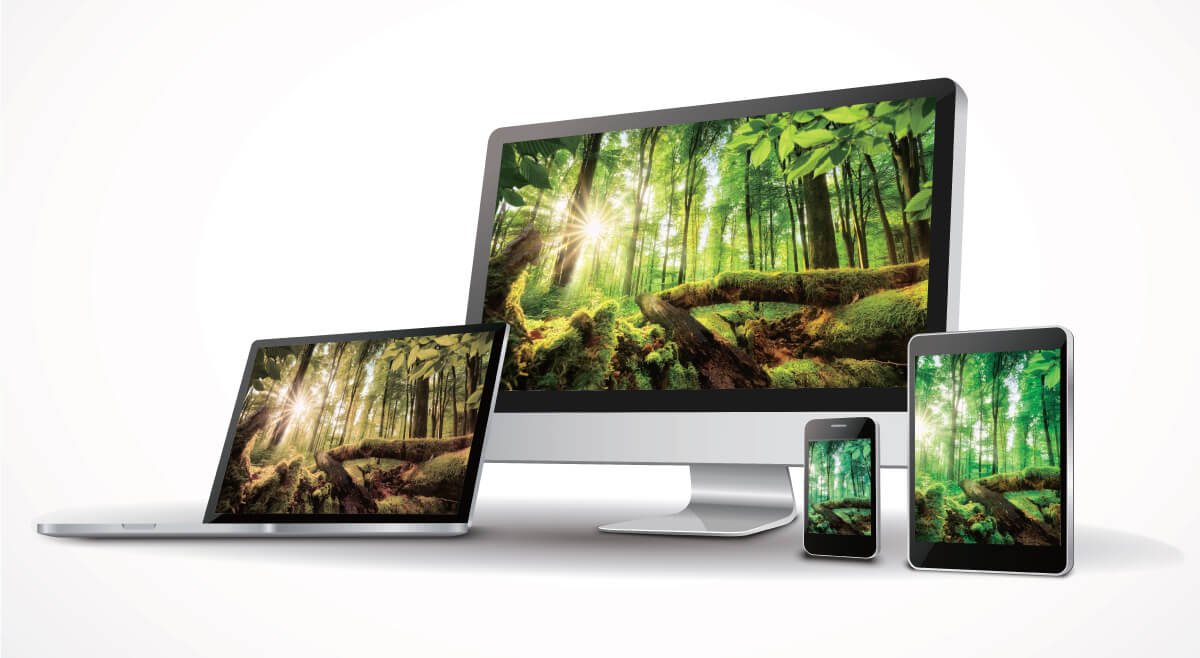
In addition to the typical monitor specifications such as panel size, resolution and panel type etc., the range of colors that can be displayed and the accuracy of the colors are also very important to photographers. When color reproduction of the monitor is poor, you can imagine that photographers won’t be able to get the colors they want when touching up the images afterwards. This has a great impact for people who rely of photography as their main source of income. Fortunately, color reproduction of monitors can be quantified and calibrated. As for how to pick a monitor with most natural and realistic colors, this is important knowledge that photographers must all have.
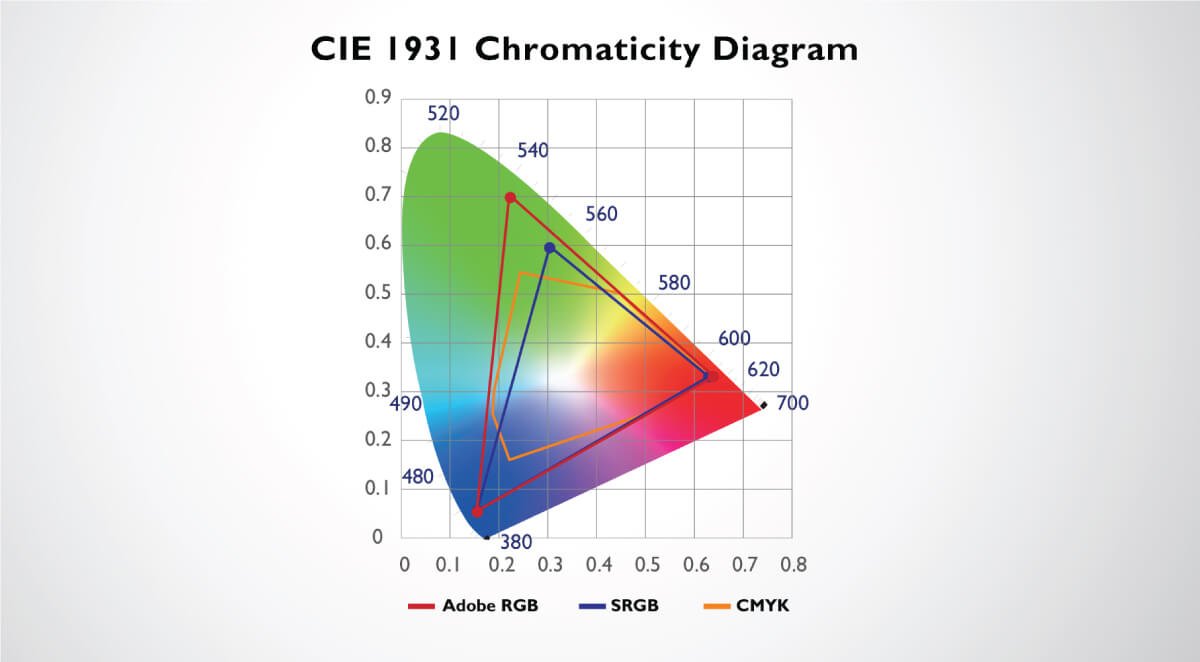
By definition, color gamut refers to the color range that can be reproduced on a particular device; from the scientific point of view, color gamut can be represented using the CIE 1931 color space. The CIE 1931 color space was defined by the International Commission on Illumination (CIE) in 1931; it allows the use of coordinate system to convert the physical measure of visible light to a two-dimensional plane (which is the CIE 1931 xy-chromaticity diagram). In the diagram, it can be seen that the whole color space is enclosed by an horseshoe. The curved edge is the spectral locus and the wavelength is marked in nanometers from the purple approximately 400mm from the left to the red approximately 650mm to the right; this represents the range that can be visualized by the human eye (the visible light spectrum) in the electromagnetic spectrum. The range of colors, or color gamut, that we frequently talk about such as sRGB and Adobe RGB etc. can all be marked using the R, G and B coordinates on the CIE 1931 xy-chromaticity diagram.
The CIE 1931 color space can be described as the basis of all color spaces; color gamuts including sRGB, Adobe RGB and CMYK etc., that we often talk about can be represented using the CIE 1931 xy-chromaticity diagram.
This is the standard RGB color space used for monitors, printers and the Internet nowadays; it was defined by Microsoft, HP and others in 1996. In recent years, most of the mainstream monitors available on the market have gradually achieved 100% sRGB color space coverage capability, which is more than enough for average word processing, surfing the net or watching movies; however, this is far from enough for professional photographers! After all, the sRGB color space has approximately 35% less color range than Adobe RGB, and it cannot fully cover the CMYK color gamut used for professional printing. And this affects the post-production and reproduction greatly.
Compared to sRGB, Adobe RGB, which was developed by Adobe Company in 1998, clearly has a wider color space, and can fully cover the CMYK color gamut used in professional printing industry. From the CIE 1931 xy-chromaticity diagram, it can be clearly seen that Adobe RGB not only has wider color gamut, it also covers blue and green region of the CMYK color gamut which sRGB is unable to cover. This demonstrates that: 1. When photographers set the color space on both their cameras and monitors to Adobe RGB, they can match the colors better to the original scene during touch up. 2. When print output is required, there wouldn’t be a huge difference between the colors previewed on the monitor and the colors on the hardcopy. Hence, this satisfies photographers’ expectation.
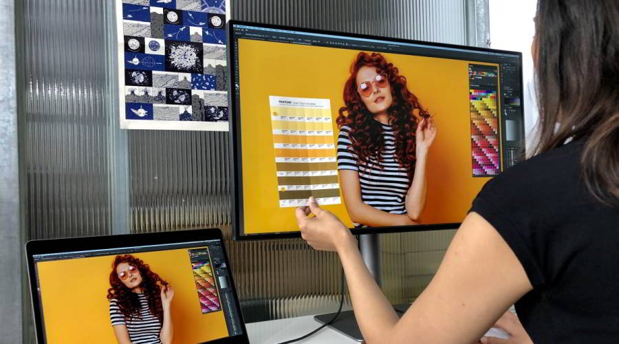
Therefore, when photographers are choosing monitors for professional work, they should first consider monitors that support 99% Adobe RGB color gamut. Not only can it provide color ranges closest to natural scene, it also allows you to easily switch between Adobe RGB and sRGB modes using hotkeys for different usage.
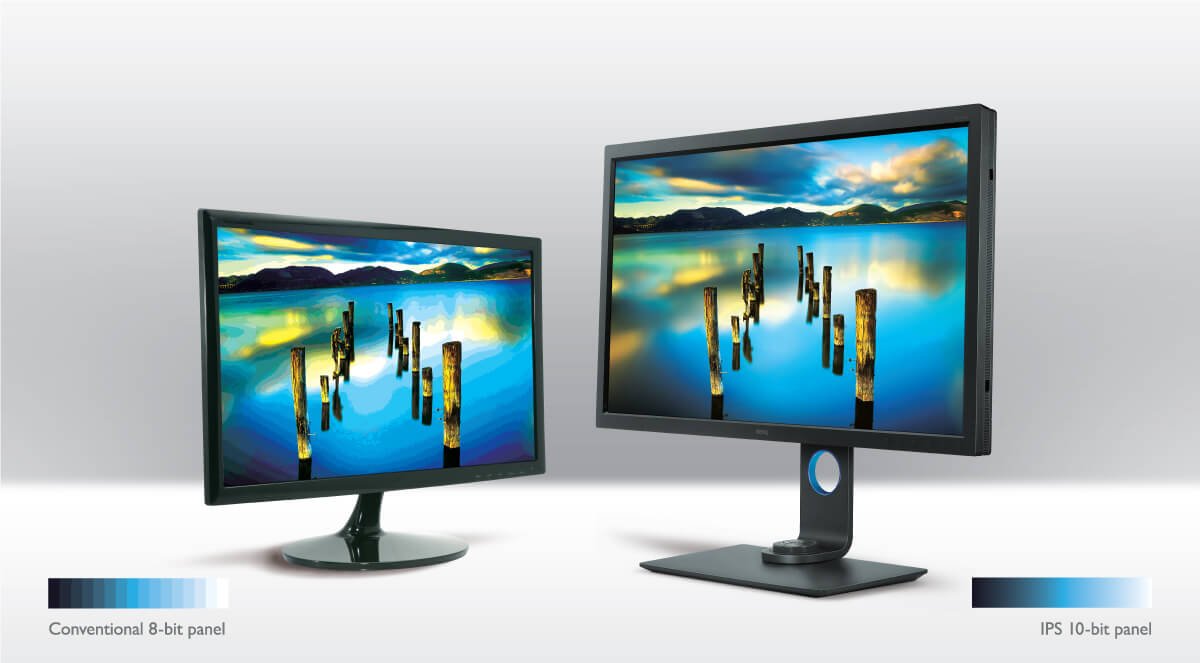
Have you ever encounter this experience? When you were touching up an dusk or sunset image, or image with gradient lights, you can easily find color discontinuation on the screen. The reason of this phenomena might be using a compressed file format (such as JPEG) for touchup, or might be due to the color bit-depth of the monitor. In a simple term, color bit-depth refers to the maximum number of colors that a device can display. The larger color bit-depth allows the monitor to display richer colors, and the color transition and gradient performance will also be more natural and continuous. From previous article, we learned that the image we see on the monitor are composed of densely packed “dots” (pixels), and each dot is composed of the three primary colors R, G and B. For most consumer monitors nowadays, they all have the basic color bit-depth of 8 bit, which means that there is 2 to the power of 8 (2^8) of each R, G and B colors; this means that the monitor can produce a total of 16.77 million colors.
But for professional monitors used by photographers or imaging professionals, such color bit-depth is still not enough. After all, almost all imaging professionals mainly take photos with RAW files, and monitors with 8 bit color bit-depth cannot help photographers to reflect the adjustments of 14 bit RAW files. Therefore, it is strongly recommended to have a monitor with a panel of at least 10-bit color bit-depth (a color display capability of 1.07 billion colors) in order to display the fine colors and light gradients and help photographers notice the finest color differences during touchup.
The color bit-depth affects the maximum total number of colors that a monitor can display; if the color bit-depth is insufficient, color and gradient discontinuation can easily be seen when photos are displayed on the monitor.
Have you ever thought about this problem? There are so many colors in this world; once the brightness, saturation or hue offsets even a little, it will become another color. So which red is a true red? And which yellow represents the correct yellow? Since everybody recognizes colors differently, the identification and preference of color are truly subjective. Therefore, a quantified method must be utilized to ensure that the monitors and even the printing devices we use have correct color display capabilities; this result of this quantified method is “color gamut”. By using quantified color gamut and solid color management knowledge, together with regular calibrations for the devices, we can ensure the most realistic colors are obtained from the input (camera) to output (monitor and printer). In other words, in order for photographers to get the best output results, not only they need to set the camera color space to Adobe RGB before shooting and shoot with RAW files, but also use professional monitors that support 99% Adobe RGB color gamut. This not only allows the photographers have more flexible area for touchup, it can also ensure the output colors from CMYK printing is consistent with what was seen on the monitor.
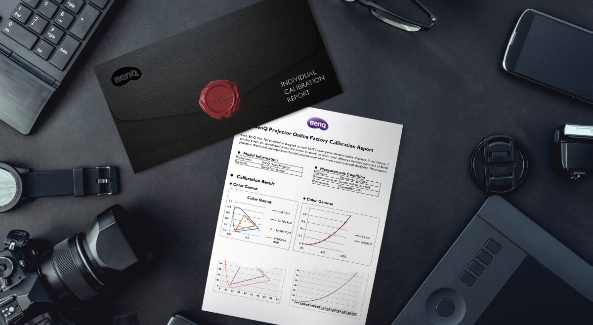
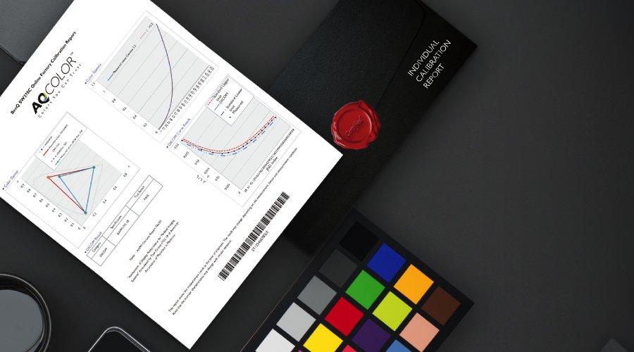
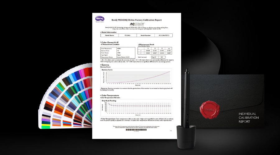
How do we define correct colors? And how can we be sure whether the colors displayed on the monitor are correct? Fortunately, colors can be quantified. Similarly, the level of difference between two colors can also be defined by quantification. This is the so-called Delta E value (International Standard Color Difference). Delta E is calculated using mathematic formulas; with Delta E values, people can define how large the color difference is acceptable. The smaller the Delta E value means the smaller the color difference. In other words, the colors are closer to standard colors.
Why is Delta E so important to photographers? It represents how accurate the colors can be on a monitor. In other words, we can clearly know what the difference is between the colors displayed by the monitor and standard colors through Delta E values. A monitor with better color rendering capability allows the user to be satisfied by the result after touchup more easily. The ideal Delta E of a professional monitor should be 0, but that’s only a theoretical value; it has to be at least <3 in order to be qualified. For a professional photographer, owning a Delta E≦2 monitor is one of the most fundamental prerequist; it ensures that when photos taken with the camera are displayed on the monitor for viewing, the colors will be similar to the standard colors. Therefore, imaging professionals should indeed consider to own a professional monitor with a factory calibration report since the monitor has already gone through rigorous testing and calibration operations by the manufacturer before shipping. Thus, it delivers a color accuracy guarantee along with peace of mind in usage.
Through Delta E, people can find out the difference between the colors displayed by the monitor and standard colors objectively, and help photographers choose the product that meets their needs the most.
If you ever go to a 3C store, you will notice that although the screens of all displayed monitors on the racks are playing the same image source, but the colors displayed on each screen are somewhat different. The reason this happens is not only because of the different brands and models, the panel type (TN and IPS) and slight deviations during mass production are also the main reasons. The former refers to each manufacturer has their own color preferences in a way, so the differences can be easily seen when the screens of different brands are placed together. The latter illustrates that even when several identical model monitors from the same brand are placed side-by-side and displayed together, it can be expected that the batch components used during the mass production might introduce some slight deviations, which also causes differences in the color displayed on the monitors.
However, will you be worry-free from now once you have a professional monitor with accurate color? Actually, a fact that you must know is that the colors of every monitor will gradually shift as the usage time increases; so how can we avoid this from happening? In the next article, we will further explain the importance and operations for regular color calibration and color management.
Did you ever wonder why the colors of each monitor are somewhat different?
{{productsCount}}Result
{{item}}
{{item.productWordingTag}}
{{currency}}{{item.finalPrice| numberThousandsCommas | numberDecimalPoint}} Save {{currency}}{{item.saveAmount | numberThousandsCommas | numberDecimalPoint}} Save {{item.savePercent | numberThousandsCommas | numberDecimalPoint}}%
new device price {{currency}}{{item.regularPrice| numberThousandsCommas | numberDecimalPoint}}
{{item}}
{{itemTag.title}}
Max 4 products to compare reached.