{{item.name}}
Price: {{currency}}{{item.price| numberThousandsCommas | numberDecimalPoint}}
Qty: {{item.amount}}
By Series
Immersive Gaming Series Home Cinema Series Projectors TV Projector Series Portable Series Golf Simulator ProjectorsBy Scenario
Home Entertainment Projectors Best 4K Projectors Best Projector for World Football Video Streaming GV Series Portable Ceiling ProjectorsBy Trending Word
4K UHD (3840×2160) Short Throw 2D, Vertical/Horizontal Keystone LED Laser With Android TV With Low Input LagExplore Commercial Projector
Professional Installation Exhibition & Simulation Small Business & Corporation Education Golf SimulatorRemote Work & Learning
Projector
Monitor
Lighting
Interactive Display | Signage
Remote Work & Learning

This copy is linked from Gavin Gough’s Blog Posting: BenQ SW2700PT 27 inch Adobe RGB Colour Management Monitor for Photographers.
(http://blog.gavingough.com/blog/2016/4/14/benq-sw2700pt-27-inch-adobe-rgb-color-management-monitor-for-photographers)
We're a picky bunch. Over time, we've probably all developed a fondness for those trusted tools which serve us well. Those tools which prove themselves to be both functional and dependable become a valued part of our working lives. I've certainly fine-tuned my gear over the years, holding on to those things which help get the job done and parting company with tools that don't deliver.
Gear can't make good images alone, of course. Photographers are fully responsible for that. But when we agree a contract with a client, we're staking our reputation not only on our talent and experience but also on the gear that we've chosen to use. You could try taking photos without relying on camera gear but I think you'll find that's called sketching.
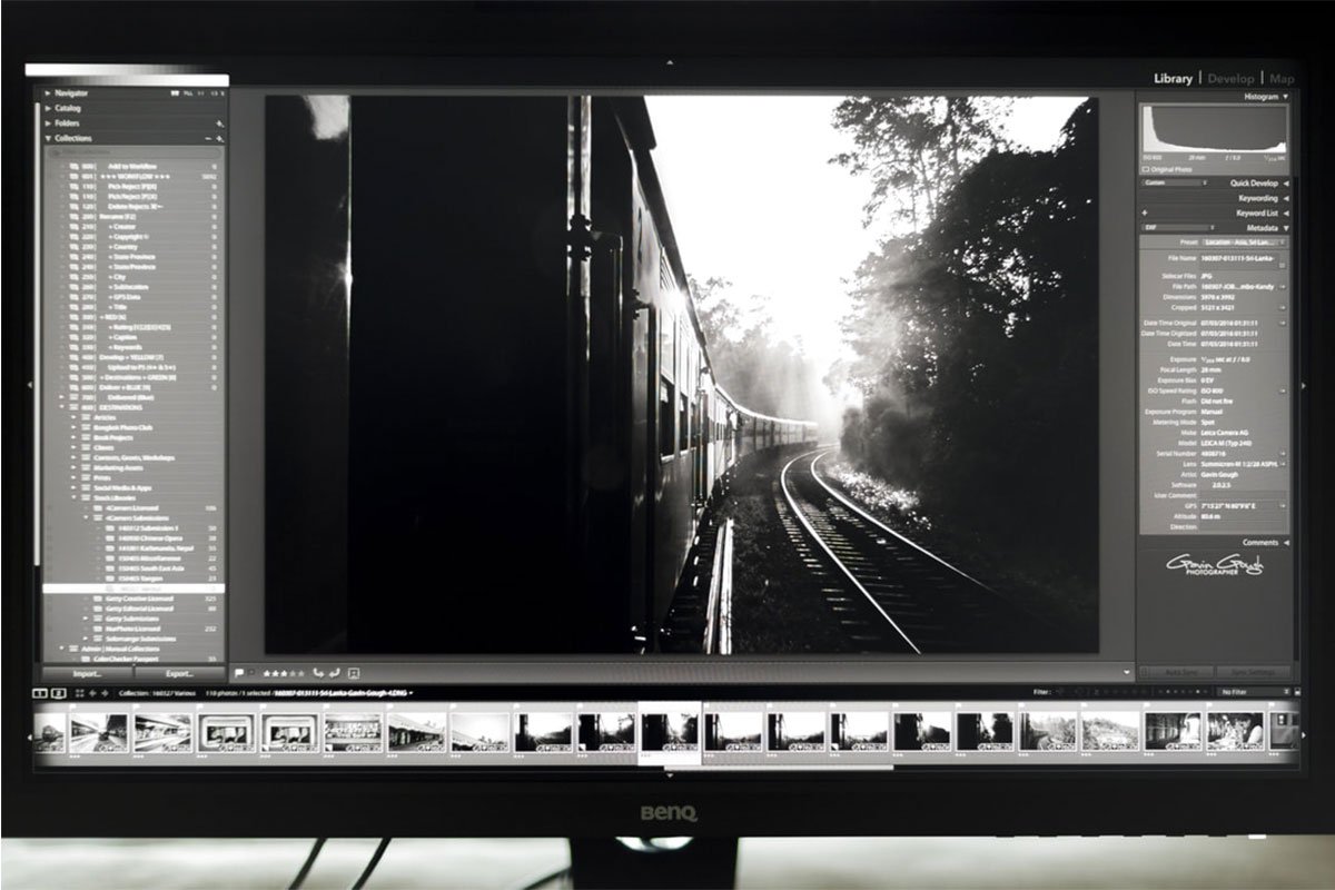
One of my favourite pieces of post-production gear was a large Apple Cinema display that I bought in 2008. That model was, sadly, discontinued soon after. I must have processed many tens of thousands of images using that monitor, which was one of the last anti-glare models that Apple made.
I fail to understand what the appeal of glossy screens is. I have a mirror in my bathroom and another in the hallway. I find that's sufficient for all my reflective needs. New Apple monitors are so glossy they're all but useless in anything other than a darkened room. I have a 27" Apple Cinema display and had to buy black shirts for processing because the reflection of anything brighter was a constant distraction. Seriously!
It was with some delight, therefore, that I welcomed an enquiry from BenQ, makers of a new "Colour Management Monitor for Photographers" asking if I'd like to test their SW2700PT display.
"Is it glossy?", I asked.
"Glossy? Why would it be glossy?"
"I don't know. Most monitors are glossy these days."
"Of course it's not glossy. If it were glossy you'd see a lot of reflections and that would make it difficult to process your photos accurately."
"I KNOW!"
"It has a 99% Adobe RGB wide colour space."
"OK. Great. But it's not glossy?"
"No. Not at all glossy."
"When can you get it here?"
"We're sending it now."
And, duly, the SW2700PT arrived, was unpacked, carefully calibrated and I've been gazing at it in silent admiration ever since.
In the interests of full disclosure, I haven't purchased the monitor, the ruggedly handsome people at BenQ sent it for me to test on the understanding that I'd write a review but, as is always the case when I accept what might accurately be described as 'hardware inducements', I make it clear that I'll write something if I really like the product and won't write anything if I think it's a dog. The fact that you're reading this will tell you that the BenQ SW2700PT is not a dog. It is, in fact, a cool cat.
If you'd like to know more about the technical whatnots of the monitor, you'll find an overview here, technical specs here and excellent case studies here, here, and here.
I will get to the technical whatnots in a moment but, first, can I share these two images with you? This is exactly what I see on my office desk and why, for me, the BenQ monitor has been a very welcome addition to my list of trusted and valued gear.
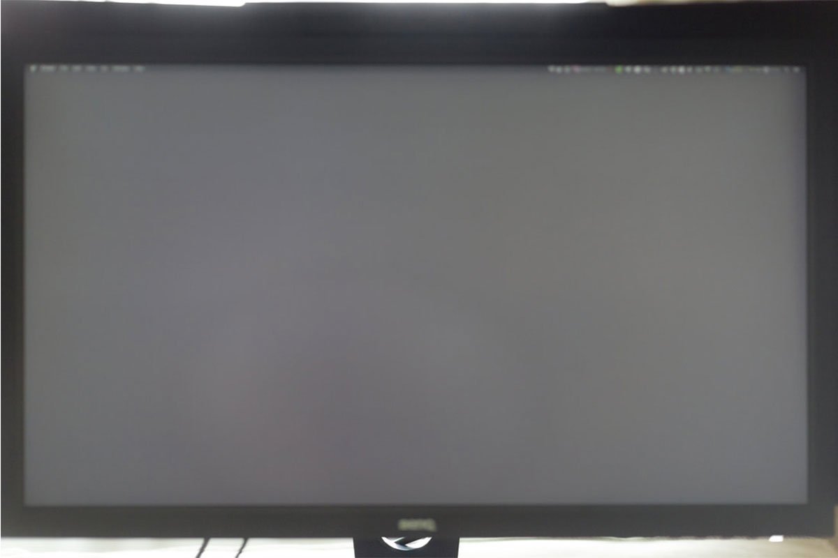
Apple Thunderbolt Cinema Display
BenQ SW2700PT Monitor
NON-REFLECTIVE
On the left... no, not a mirror, but my 27" Apple Thunderbolt display. On the right, my 27" BenQ SW2700PT. Taken in identical light, moments apart, on an overcast day with light curtains across the windows in my office with both monitors displaying a mid-grey background. A typical office setting, in other words.
That glossy, reflected image would be my starting point if I were processing on the Apple monitor on the left. Well, not strictly true as I would change into one of my black "Processing Shirts", draw the curtains and remove the picture hanging on the wall behind me but I don't think it should be necessary to undergo a complete wardrobe change and feng shui session in order to start work.
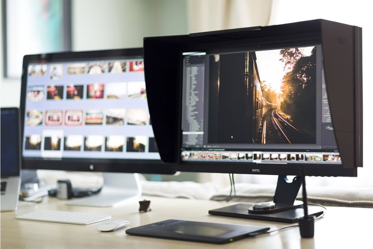
SHADING HOOD
The BenQ comes with a detachable, light-absorbing hood, which prevents stray light from hitting the screen and has allowed me to reacquaint myself with daylight. Darkened processing sessions are a thing of the past. The hood has a canny gate at the top, allowing a calibration device to be dropped onto the screen below, which introduces the real benefit of the SW2700PT, beyond it's non-reflective screen.
As digital photographers, I would say that our work is only 50% complete when we press the shutter release and make a photo. Years ago, when I was shooting Fuji Velvia and Kodachrome slide film, I'd be 95% done when I clicked the shutter. All that remained was printing neat captions on labels to fix to the slide mounts. Things have certainly changed. With the immediacy and flexibility of digital photography comes a considerable extra workload. Those RAW files are going to require careful management before they're ready to send out into the world. When I calculate assignment budgets, I reckon on a 1:1 ratio of shooting/processing. For every day I spend on assignment, I'll expect to spend another day processing.
I think we need to adjust our expectations about where we expect to allocate resources when shooting digital. As well as the 1:1 shooting/processing ratio; for every pound, euro or dollar I spend on camera gear, I pretty much expect to spend another on post-production hardware and software.
Which brings me to the technical whatnots and the thorny issue of colour management. I warn you, there will be charts and acronyms ahead.
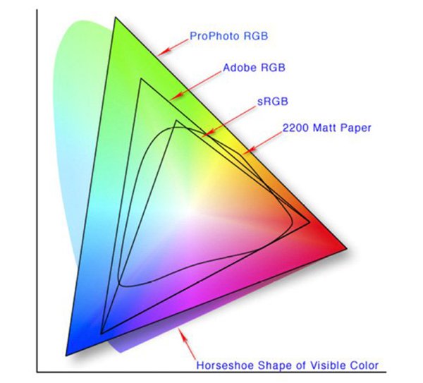
When you shoot a RAW file, your camera captures a really wide gamut of colours. When you view that image in Lightroom, for example, you'll see an interpretation of that colour data presented in the ProPhoto colour space.
In this diagram, you can see the curved horseshoe shape indicating colours visible to the human eye. The digital ProPhoto colour space is the nearest colour gamut to that.
Yielding a smaller colour gamut, the Adobe RGB colour space is the one most commonly associated with printing. Printers aren't capable of fully realising the wider ProPhoto space. What does that mean in practice? It means that when you print a photo, you're potentially going to lose some of the colours recorded in your image file.
Smaller still is the sRGB colour space. This space is most commonly associated with computer displays. It's significantly smaller than AdobeRGB and a great deal smaller than ProPhoto. What does that mean? It means that when you view a digital image on an sRGB screen, you won't see all of the colours available in the file's data.
These differences are further complicated by the hardware you're using. Dedicated monitors typically display a wider range of tones and have better black, white, grey and saturation accuracy than laptop displays. Smaller displays yield less accuracy than larger displays, generally. So a 12" MacBook Pro doesn't display colours and tones quite as accurately as a 13" MacBook Pro, which, in turn, is less accurate than a 15" MacBook Pro.
In practice? It means that you really wouldn't want to be doing any critical processing work on a laptop screen. More than that, it means it's virtually impossible to accurately process files for printing on an sRGB monitor.
Most displays, including my disturbingly glossy Apple monitor, display a reasonably accurate version of the sRGB colour space. Until recently, you will have needed to invest a substantial amount of money to own a monitor capable of displaying the wider AdobeRGB space. Chances are, you're looking at an sRGB monitor right now, which means that I can't share the main benefit of the BenQ SW2700PT with you, which is that it's capable of displaying 99% of the wider Adobe RGB colour space.
I made the simulation below by changing colour profiles for the balloon image, just to give an idea of what can happen when colour spaces change. In the sRGB simulation, colours may look more saturated but you'll see blocks of solid colour with little variation, especially in the oranges, reds and purples. In the AdobeRGB simulation, you'll see a more accurate, wider range of hues with a more nuanced gradation across the tones.
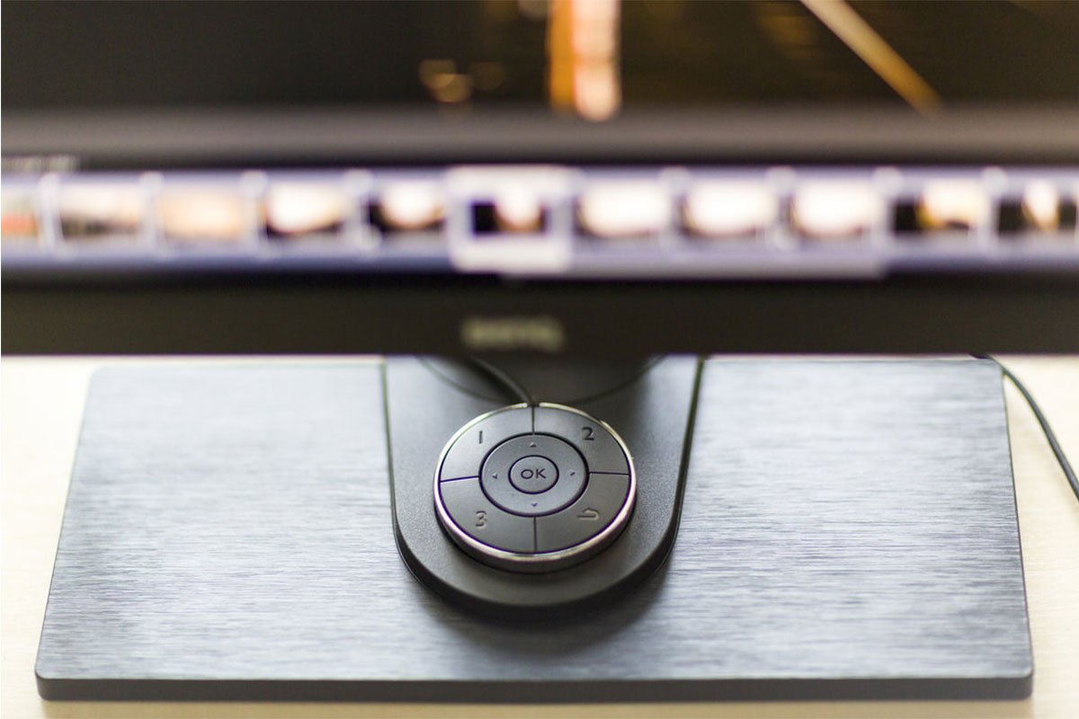
The BenQ monitor comes with an OSD controller. At first, I hoped it was something that would cure my compulsion to check that the door is locked eight times when I leave home but I think that's OCD - different sort of control, apparently.
The OSD controller gives access to the on-screen menu and provides customisable shortcut buttons, which can be set to switch between profiles. I've set mine to provide quick access to AdobeRGB, sRGB and Black & White profiles. At the touch of a button, I can switch between colour spaces and see how my image processing is going to affect the file in various formats.
The OSD Controller
One click for black & white mode
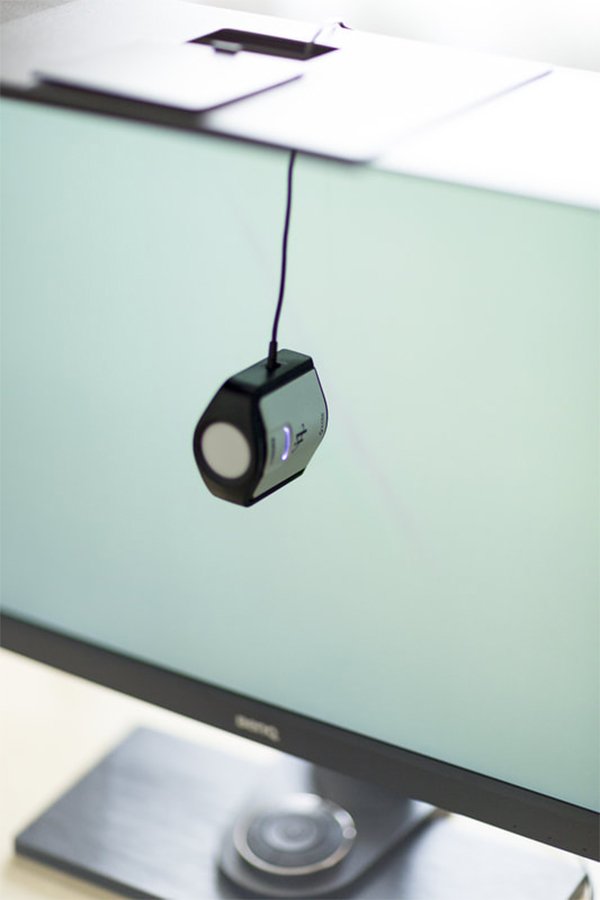
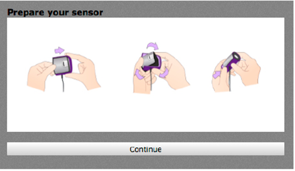
The BenQ has built-in hardware colour calibration tools and comes with BenQ's Palette Master calibration software. It worked really well with my X-rite i1 Display Pro /Calibrite ColorChecker Display Pro, giving the sort of straightforward step-by-step instructions that I really appreciate. It even detects how the calibration tool is orientated and suggests that you turn it the right way around. I've written at some length in other places about the importance of regular colour calibration. Without it, your monitor won't render colours accurately and your processing will inevitably include a degree of randomness. Calibrating isn't difficult, takes very little time and the benefits really outweigh the investment required.
The SW2700PT has two USB3 ports and an SD card slot, making it easy to add peripherals, such as a high speed card reader and to download from an SD memory card. It also has DVI-DL and HDMI input/output connections. It comes boxed with all the necessary leads and took me about ten minutes to set up and connect to work alongside my Apple gear.
The monitor displays an impressive 109 pixels per inch and has what I'm reliably informed is a "14-bit 3D LUT (Look-up Table) and Delta E≤2". What does that mean? It means that colours are rendered accurately and smoothly. In practice, it means that I can process images more consistently and with greater confidence than I could with a lower-spec display. I can't show you the difference but I reviewed a series of images in three different displays: a MacBook Pro 15", a 27" Apple Cinema HD and the BenQ SW2700PT and the BenQ is noticeably better at handling fine gradations and subtle details. Whilst you may not need that quality if you're only concerned about posting images to Facebook, if you're ever planning to publish photographs, make prints, compile a book or enter images into competitions, having that extra detail will be crucial.
This, I think, might be the monitor's biggest selling point. Yes, it has all of the qualities you'd expect from a professional monitor but BenQ have cleverly pitched it specifically at photographers who want quality but might not have the budget to pay what those pro monitors usually cost. Monitors of this quality typically cost in excess of $1,500, often $2,000 - $3,000. Looking at B&H just now, I see the SW2700PT is available for $599.99. That's less than the cost of a half-decent lens. By way of contrast, a 27" Apple Thunderbolt display is currently $999.00. Interestingly, a mirror at my local furniture emporium would only cost $20 and yet would yield similar results to the Apple display. Looking at the Apple and BenQ monitors side by side on my desk right now, there's no question which I would use for processing. The BenQ wins hands down.
What does all this talk of colour spaces and gamuts really mean? One of the things that puzzles me (and there are many but we'll stick to photography for now) is the fact that photographers will invest a great deal of time, effort and money into obtaining really impressive cameras and lenses, capable of capturing a bazillion pixels in high definition with fabulous dynamic range but then fail to use all that information. Modern, digital cameras are essentially just data capturing devices. Why have a device capable of capturing a really wide range of data and then immediately throw that data away? If you shoot JPEGs or work only in sRGB then that's pretty much what you're doing.
Unless you're a sports or spot news photographer with immediate deadlines, where image quality can be sacrificed for speed of availability, there doesn't seem to be a good reason for that (please, don't write in).
- Gavin Gough
If nothing else, using the BenQ SW2700PT has allowed me to open the curtains, reveal the daylight, put my pictures back on the wall and change into more colourful attire. I feel very nearly human again. And that, dear friends, is no small achievement.
You can find out more about the BenQ SW2700PT here.
For my friends and colleagues in Asia, you'll be pleased to learn that the monitor has just been made available for sale in our part of the world.
Get One Free Year Pantone Connect
{{productsCount}}Result
{{item}}
{{item.productWordingTag}}
{{currency}}{{item.finalPrice| numberThousandsCommas | numberDecimalPoint}} Save {{currency}}{{item.saveAmount | numberThousandsCommas | numberDecimalPoint}} Save {{item.savePercent | numberThousandsCommas | numberDecimalPoint}}%
new device price {{currency}}{{item.regularPrice| numberThousandsCommas | numberDecimalPoint}}
{{item}}
{{itemTag.title}}
Max 4 products to compare reached.